Work Samples
I offer fluid design styles tailored to each project, while maintaining consistency within each visual direction.
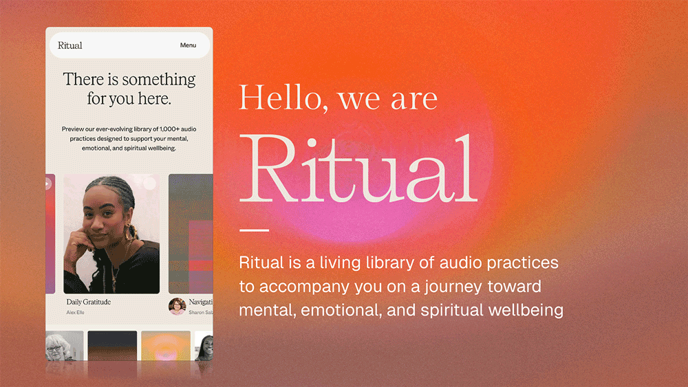
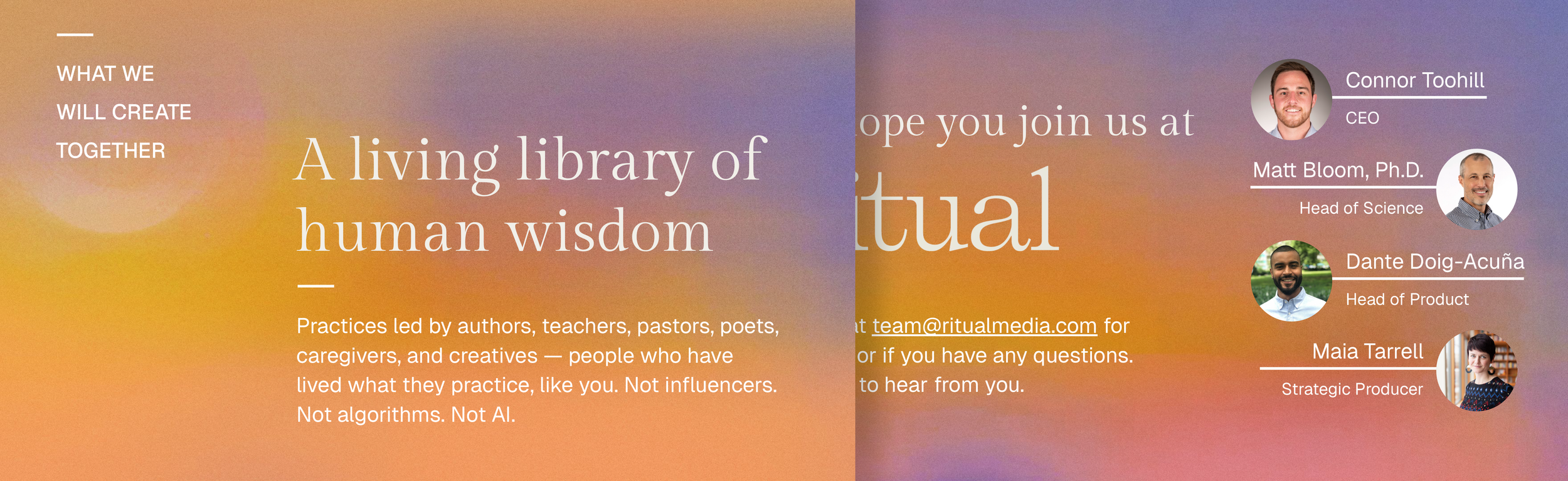
Ritual Media: Presentation Deck
Ritual is a wellbeing platform offering guided wellbeing & spiritual practices from the world’s leading experts. They partner with leaders in science, faith & culture to create guided audio experiences. This presentation deck was developed using their brand guidelines to support outreach efforts to potential new partners.
Scope: Presentation Design
Client: Ritual Media
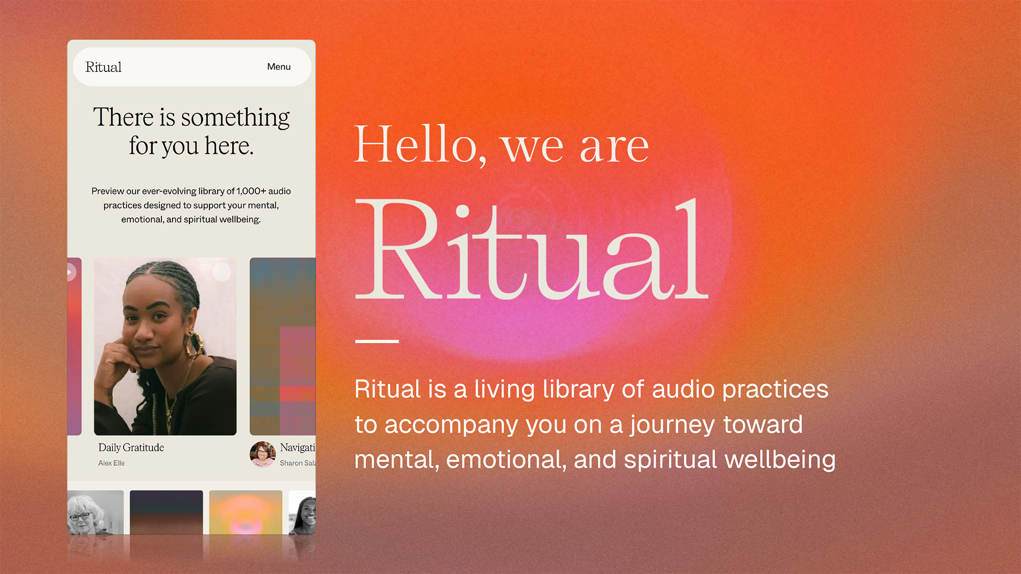
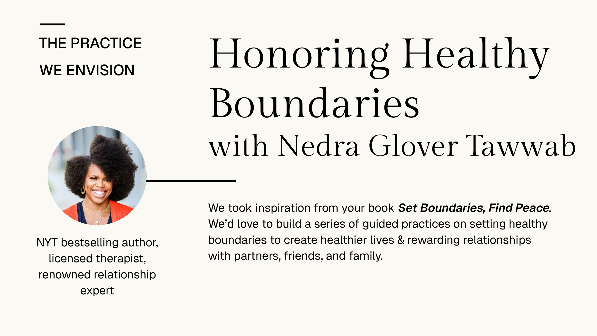
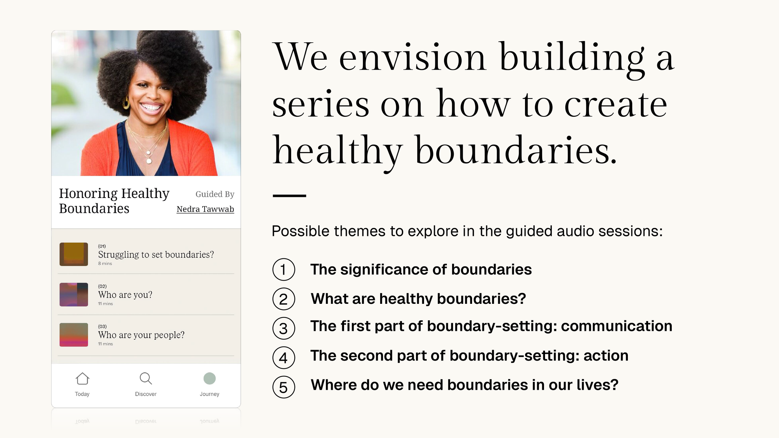
This presentation template was developed as a component of Ritual’s branding overhaul.
It was specifically created for Google Slides. It includes several layout options, font specs, and a series of background art.
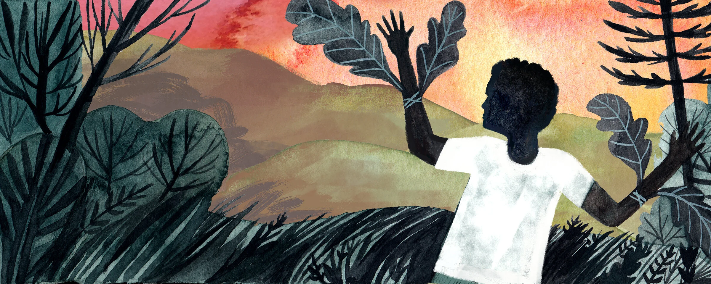
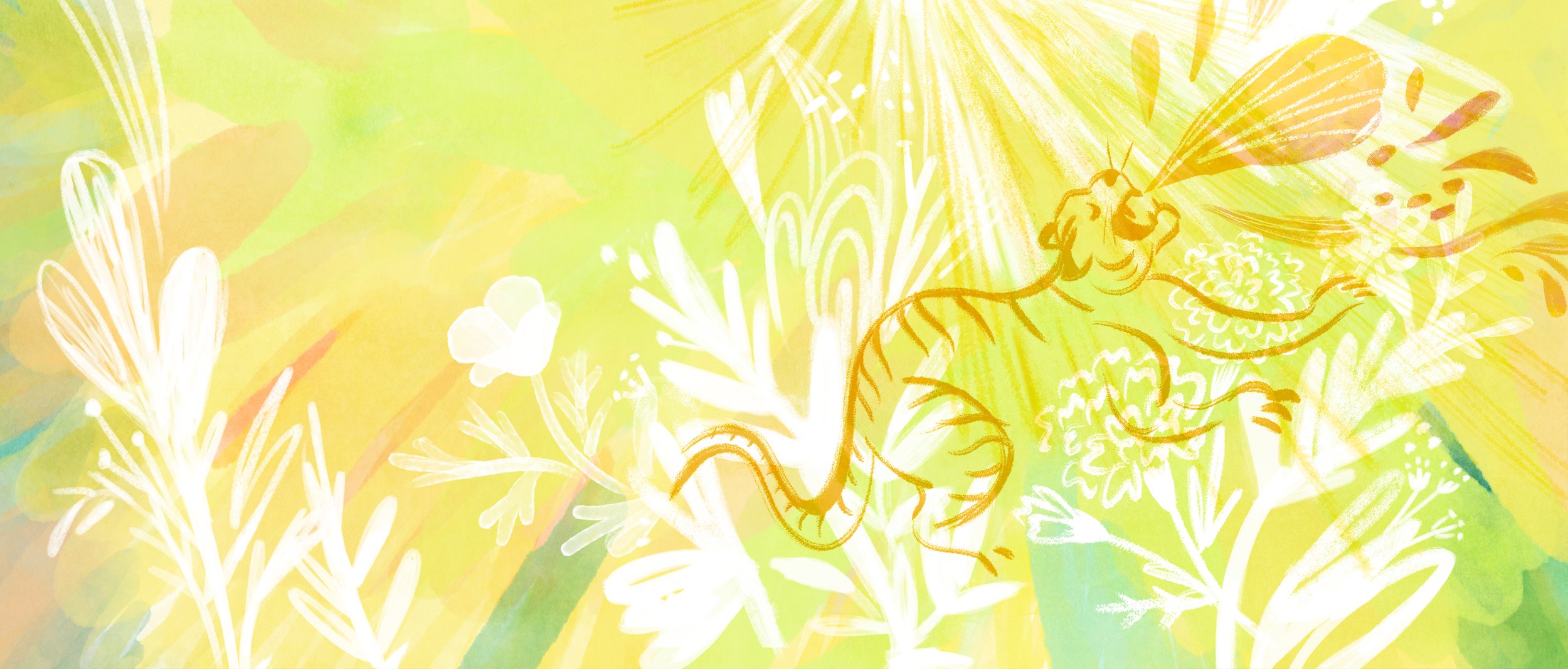
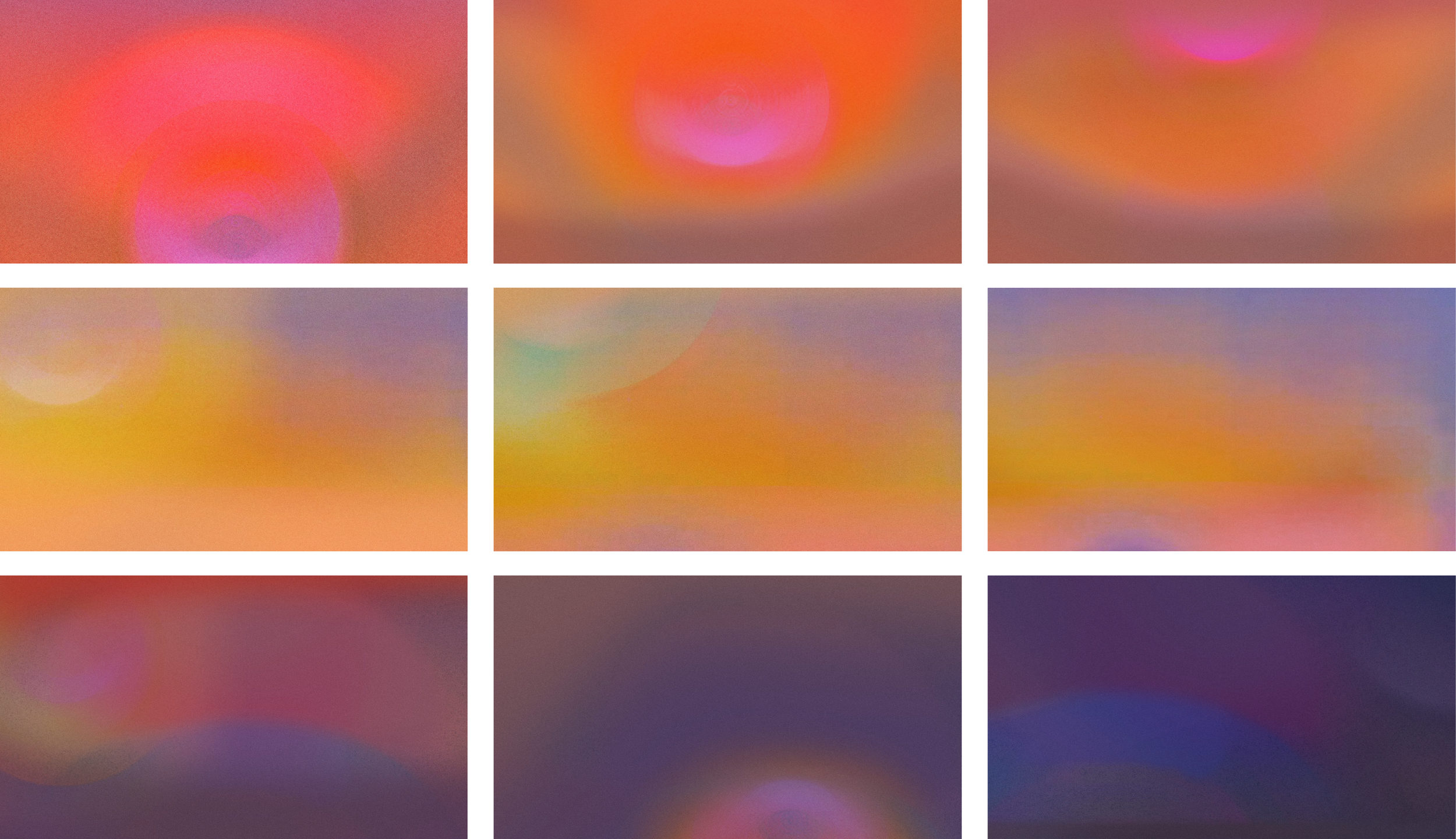
The new brand identity uses artworks as a visual anchor. On the Ritual app, each wellbeing practice is paired with an artwork created by contemplative artist David Grey. Below are samples of background art created for the Google Slide template based on the new series artworks.
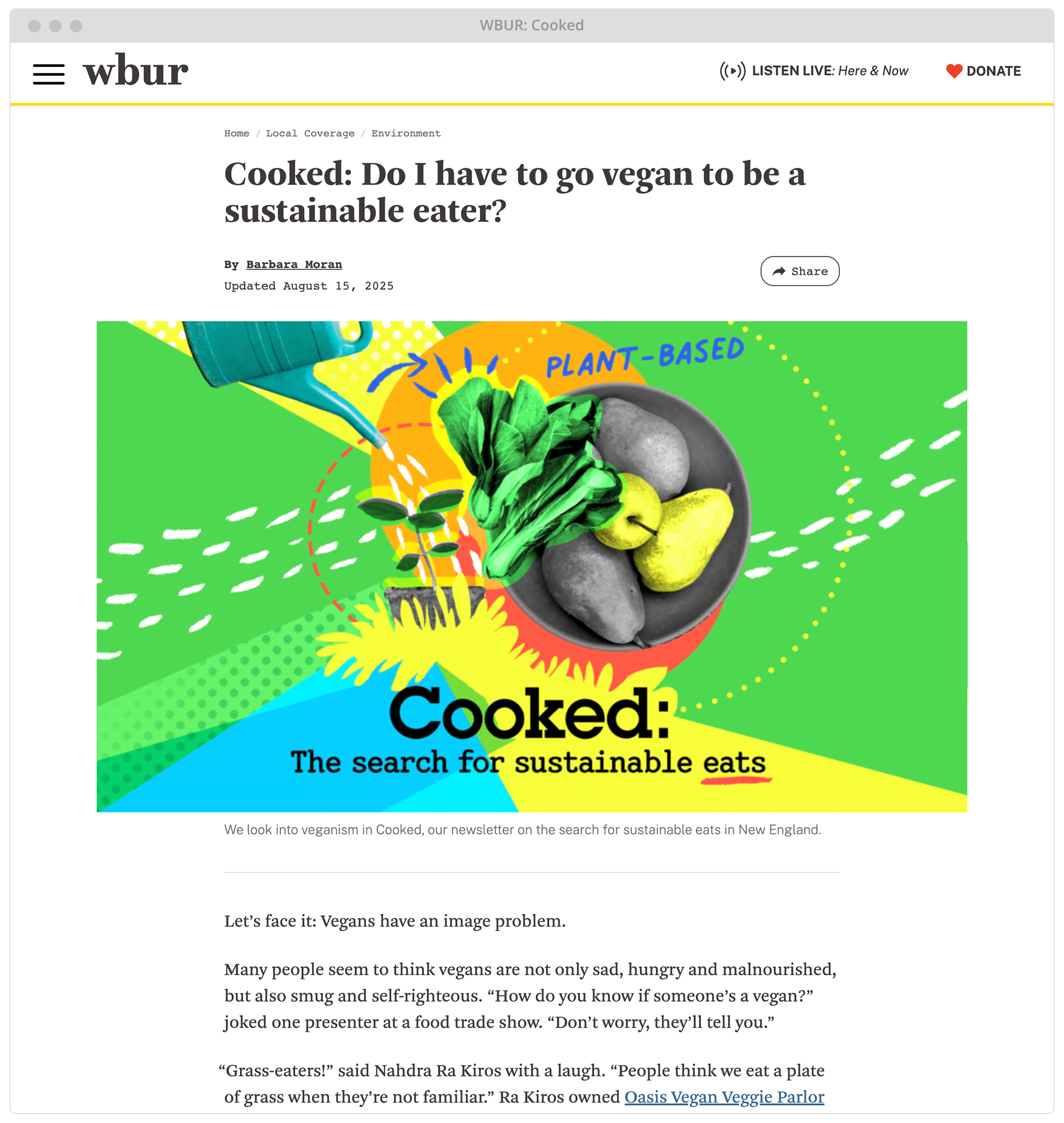
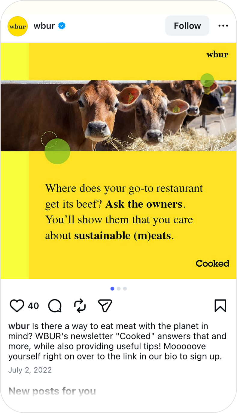
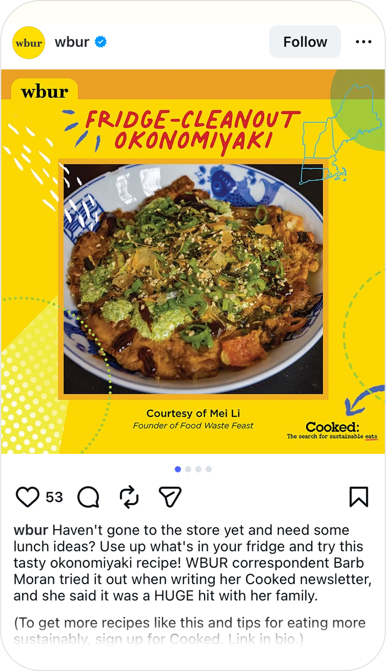
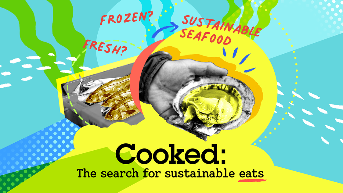
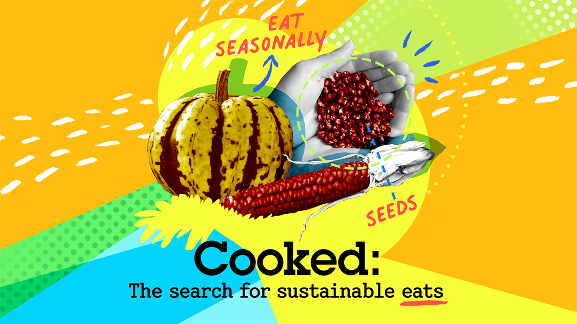
WBUR’s Cooked Newsletter
Cooked: The search for sustainable eats is a newsletter series from WBUR’s Environmental Team to help New England readers understand the environmental and social impact of what they eat. It gives readers advice, tips, recipes for making more sustainable choices.
Scope: Visual Identity/Branding, Logo Design, Social Media Strategy
Client: WBUR
Additional Credits: Meagan McGinnes (WBUR Senior Editor)
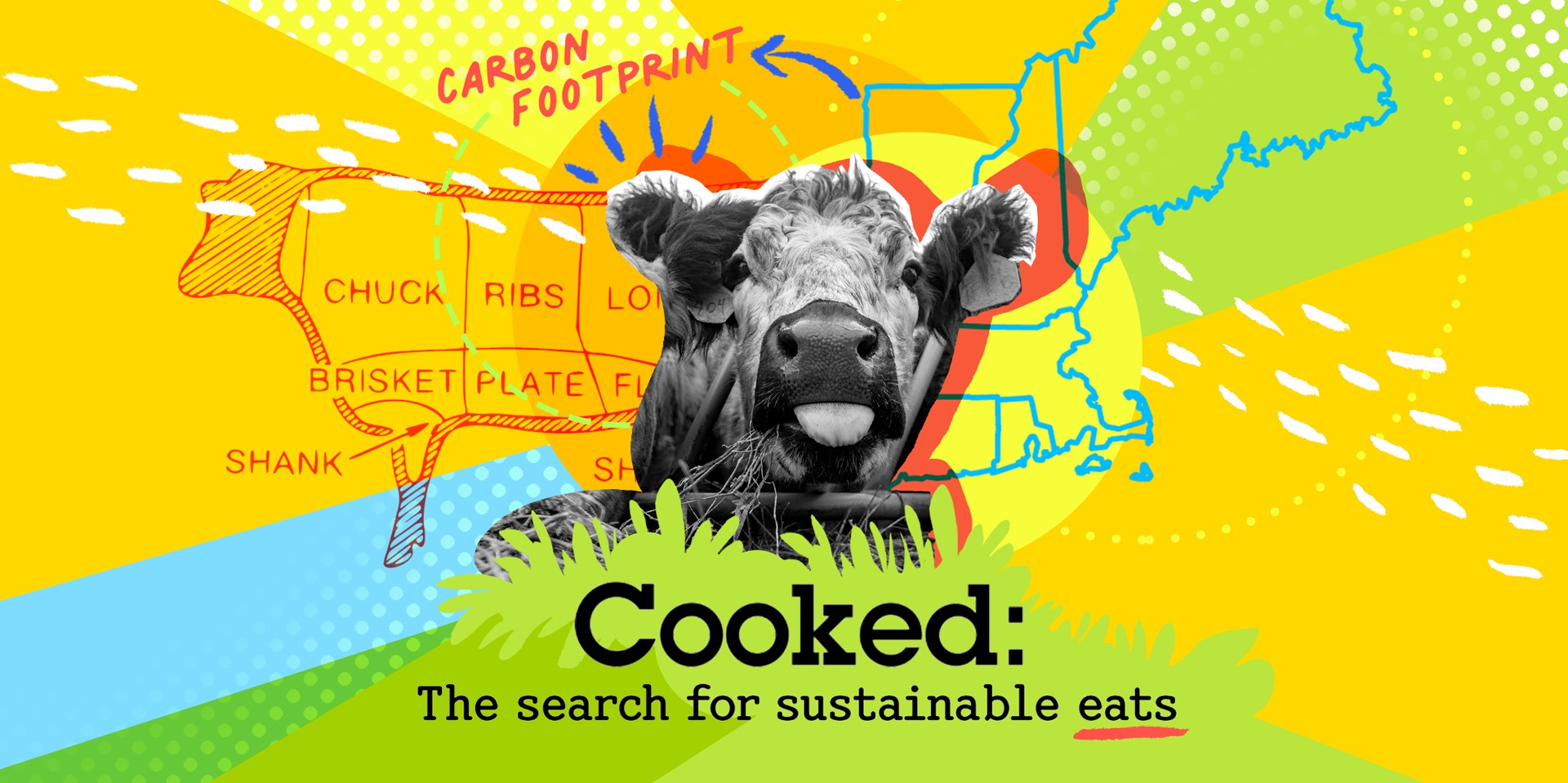
The Cooked series helps readers understand how to reduce their impact on climate change & take actionable steps so they can make a real difference

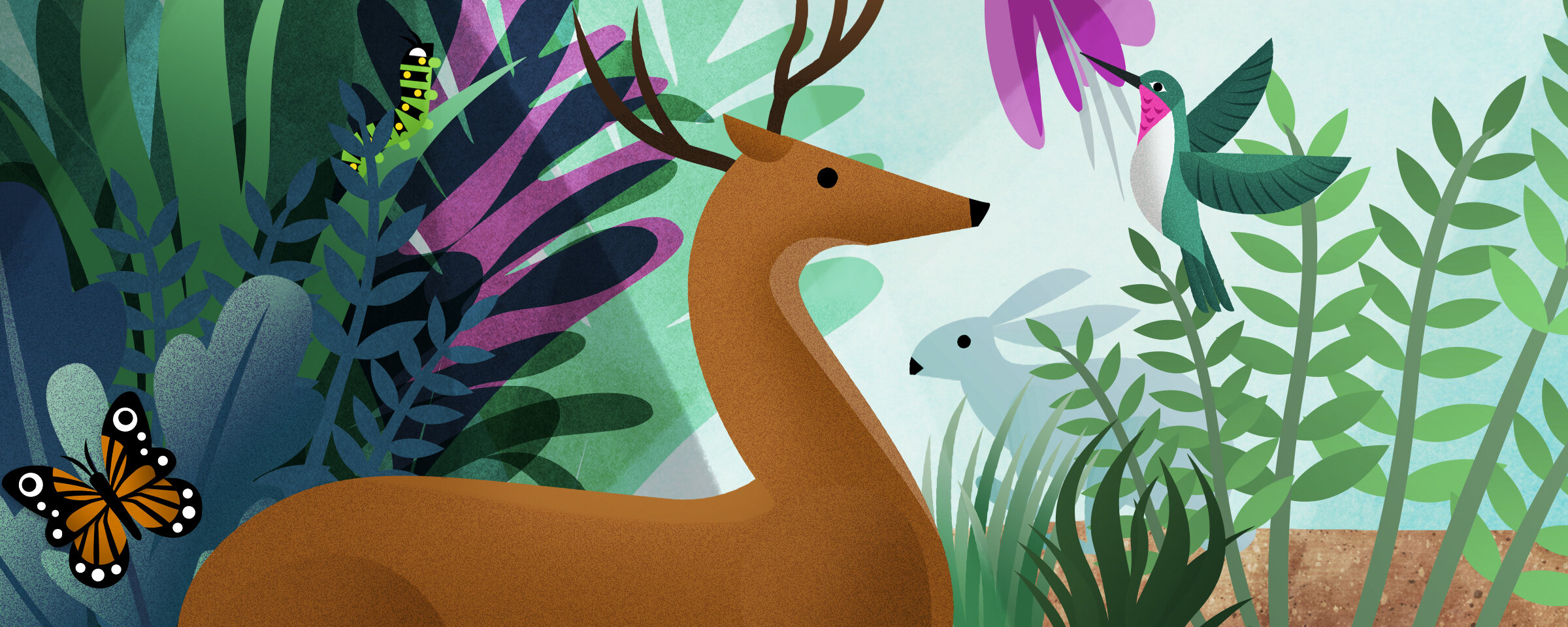
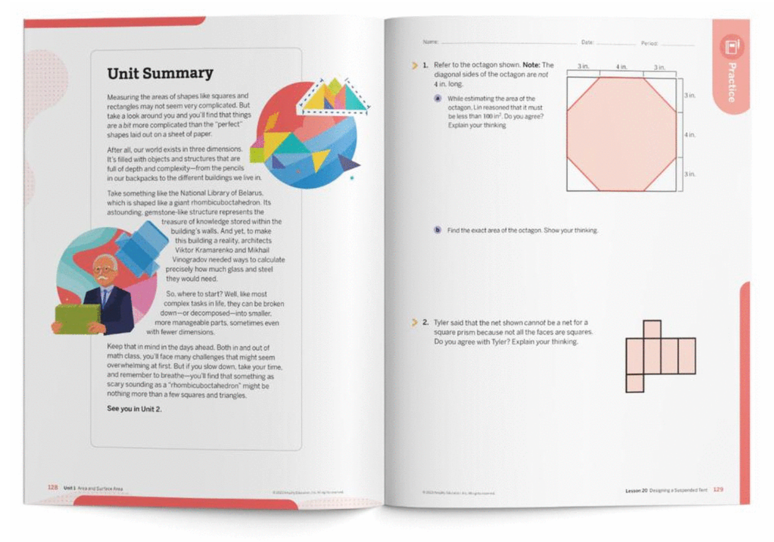
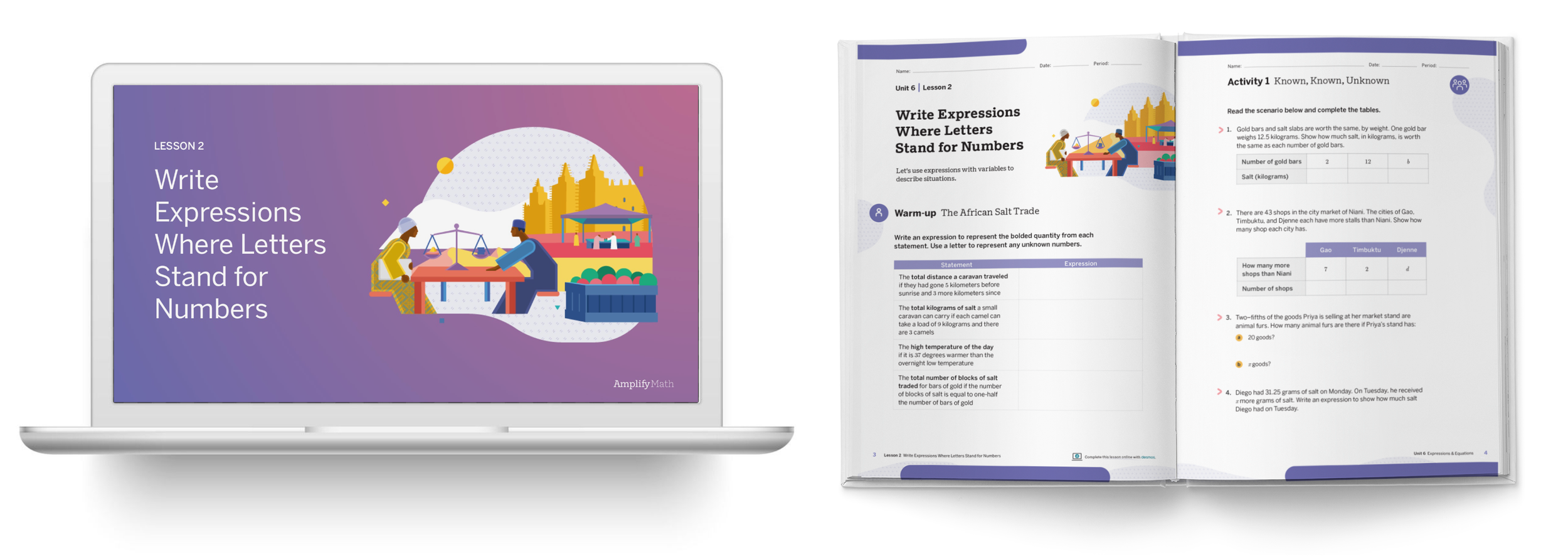
Amplify Math
Amplify creates interactive core curriculum that inspires students to learn in a fun, creative, and challenging way. They partnered with Desmos to build social, collaborative curriculum for K-5 and middle school math, including online learning tools and workbooks.
Scope: Brand Identity refresh, Illustration, Wayfinding system design
Client: Amplify Math
Additional Credits: Todd Rawson (Design Director)

I worked with curriculum developers to refresh the visual system for Amplify Math grade bands (K-5, 6-8 and 9-11) to be implemented across its printed materials, as a compliment to the digital curriculum.
This includes updating the visual language and cover illustrations as well as the wayfinding system of labels for clearly and easily navigating printed materials.


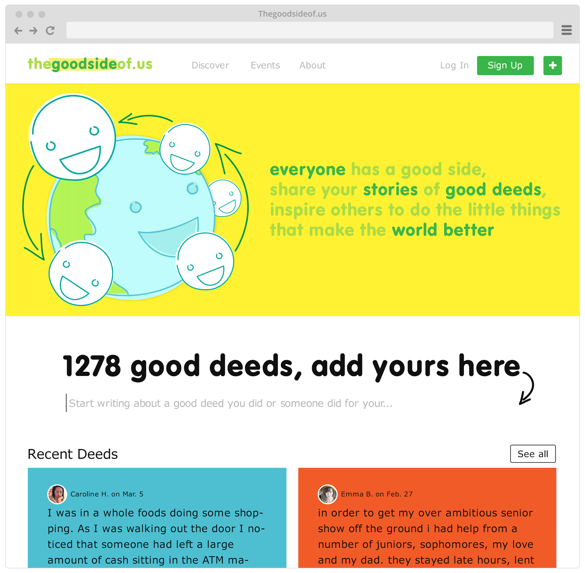
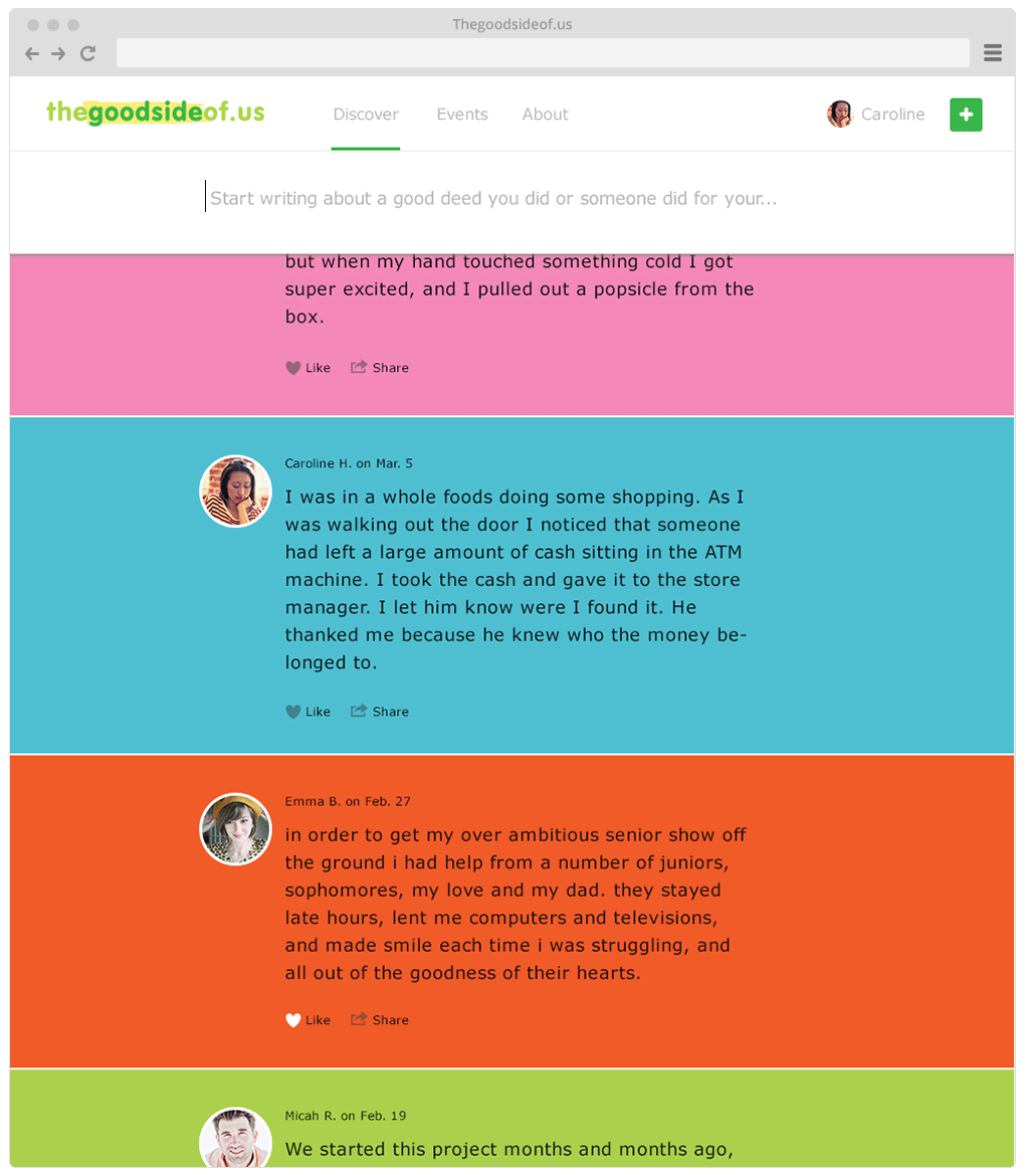
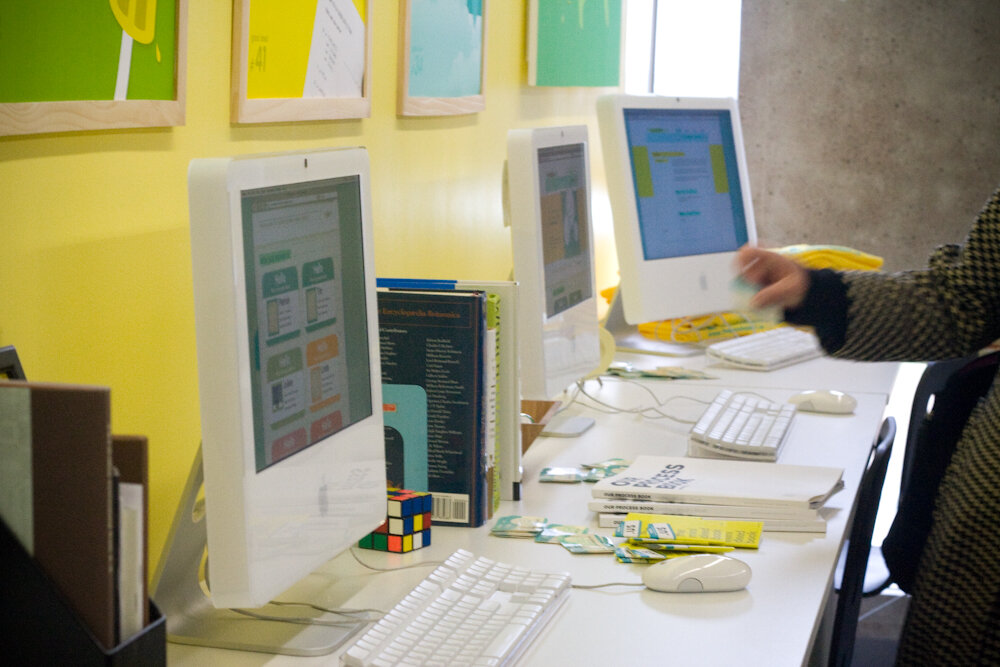
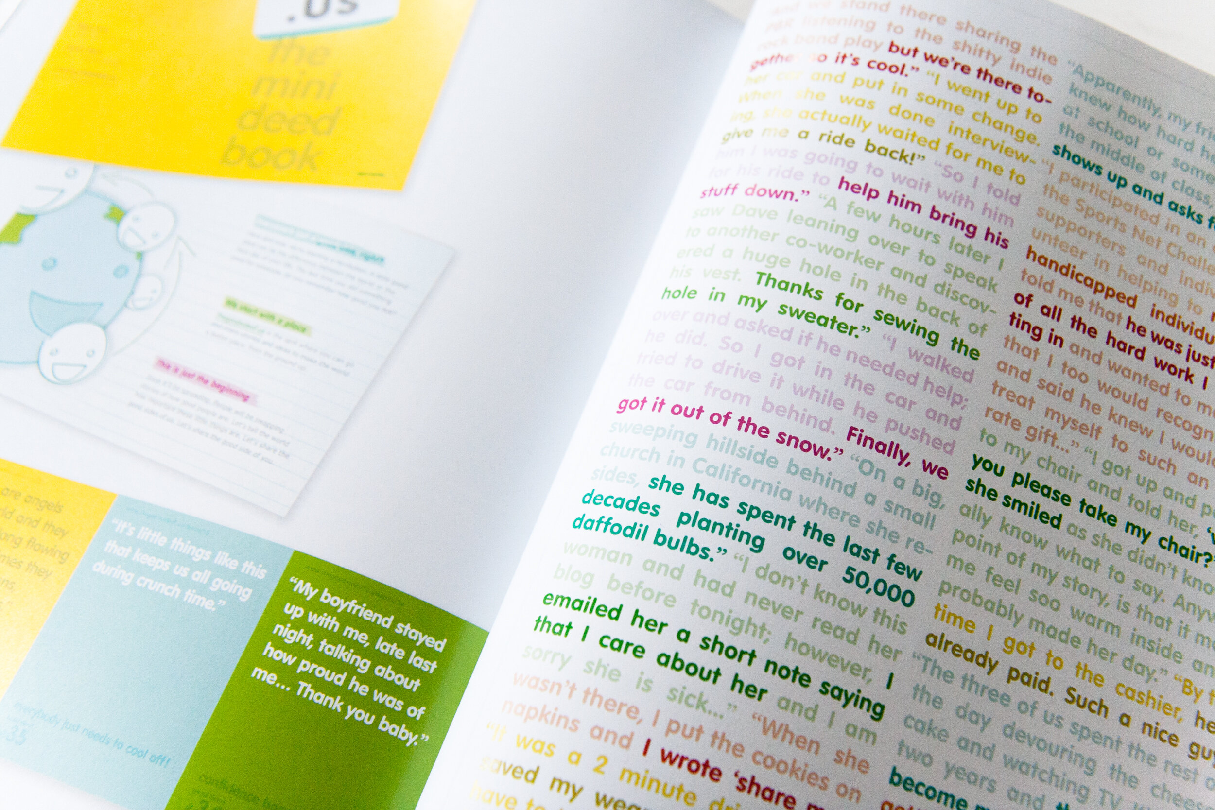
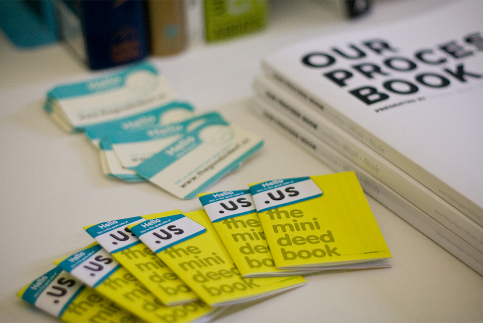
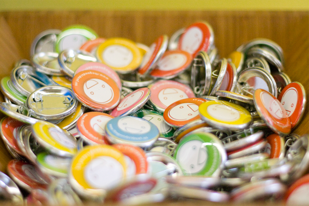
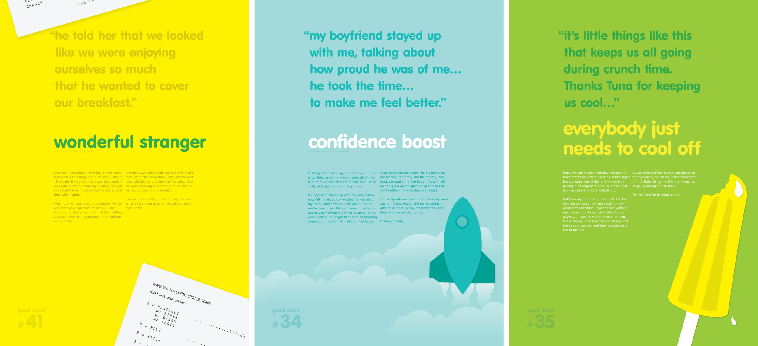
Thegoodsideof.us
For this project, I collaborated with two fellow designers. We believe that designers have the power to create change, so we wanted to make something that could do some good in the world. We created thegoodsideof.us. As a website, it’s a place to share stories of little good deeds that people encounter daily. As an idea, it’s a revolution in what it means to make the world a better place.
Scope: Product/Concept Development, Brand Strategy, Visual Identity, UI Design, Event Coordination & Marketing
Community project: Otis College of Art & Design, Los Angeles, CA
Additional Credits: Micah Rich (Designer/Web Developer), Nicole Week (Designer)