Work Samples
I offer fluid design styles tailored to each project, while maintaining consistency within each visual direction.
The League of Moveable Type
The League of Moveable Type is an open-source type foundry. We realized that there are a lot of free fonts out there, and as designers, we wanted to raise the standard of typography and design on the web.
Scope: Co-Founder, Product/Concept Development, Visual Identity, Type Design
Additional Credits: Micah Rich (Co-Founder)

We created an open-source type foundry where we focus on quality not quantity, to provide people with hand-picked high quality typefaces.

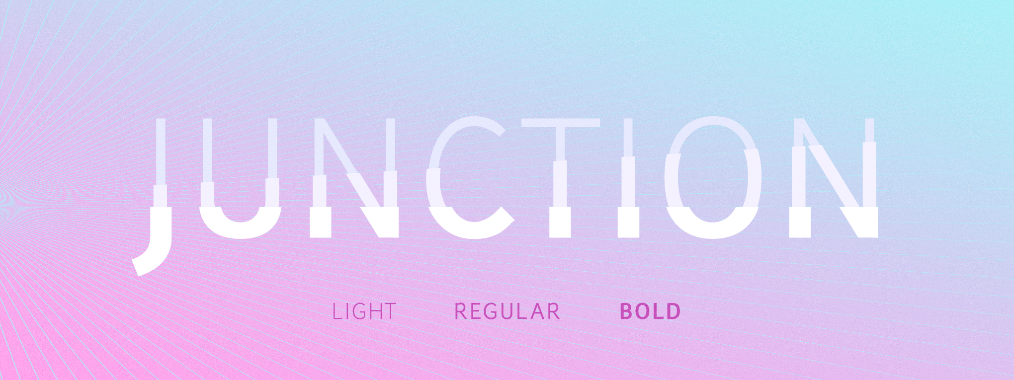
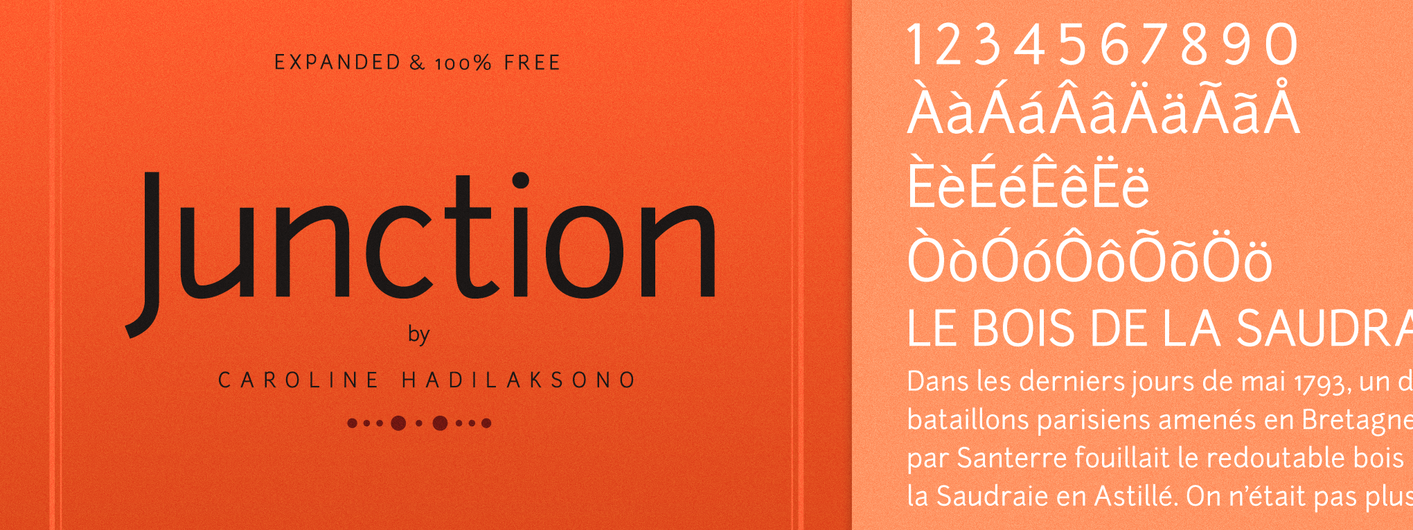
Junction
The very first typeface we added to The League's font library was Junction, a humanist sanserif typeface I’d designed.

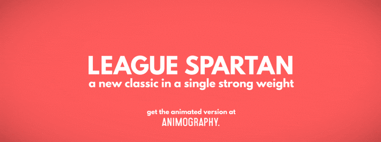
Revival typefaces
I designed two revival typefaces exclusively for The League’s catalogue: League Gothic & League Spartan, both are old classics and two of our favorite typefaces.


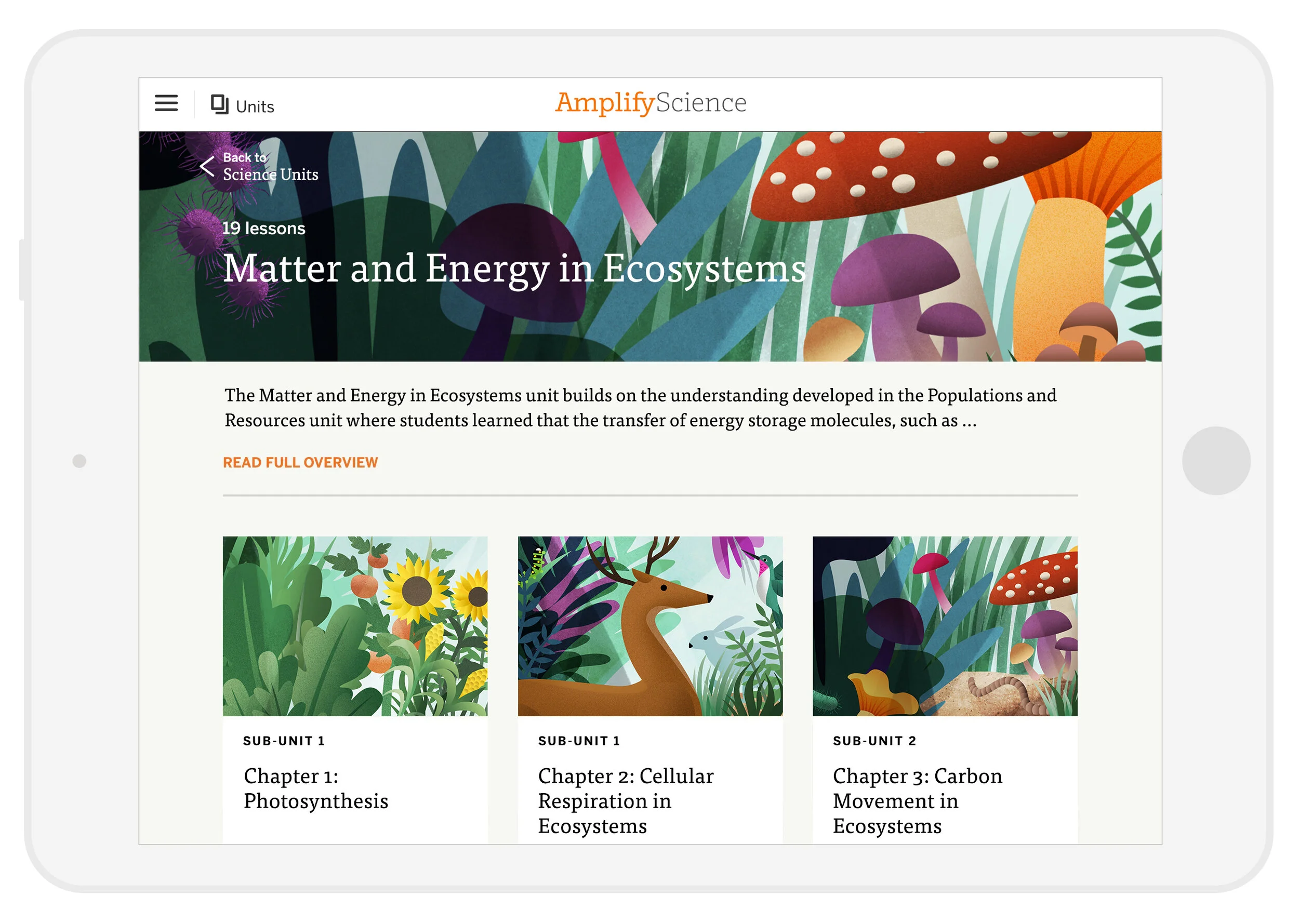
Amplify Science
Amplify creates interactive core curriculum to be used in the classroom. The goal is to inspire students to learn in a fun, creative, and challenging way. They partnered with UC Berkeley’s Lawrence Hall of Science to create their digital Science curriculum. I worked with curriculum developers to design the user experience as well as the look and feel for this Matter & Energy Ecosystem simulation app.
Scope: Product Design, UI Design, Concept Art, Illustration
Client: Amplify Science
Additional Credits: Thomas Maher (Design Director)

We wanted to help students visualize how carbon moves through the ecosystem in a beautiful interactive simulation.


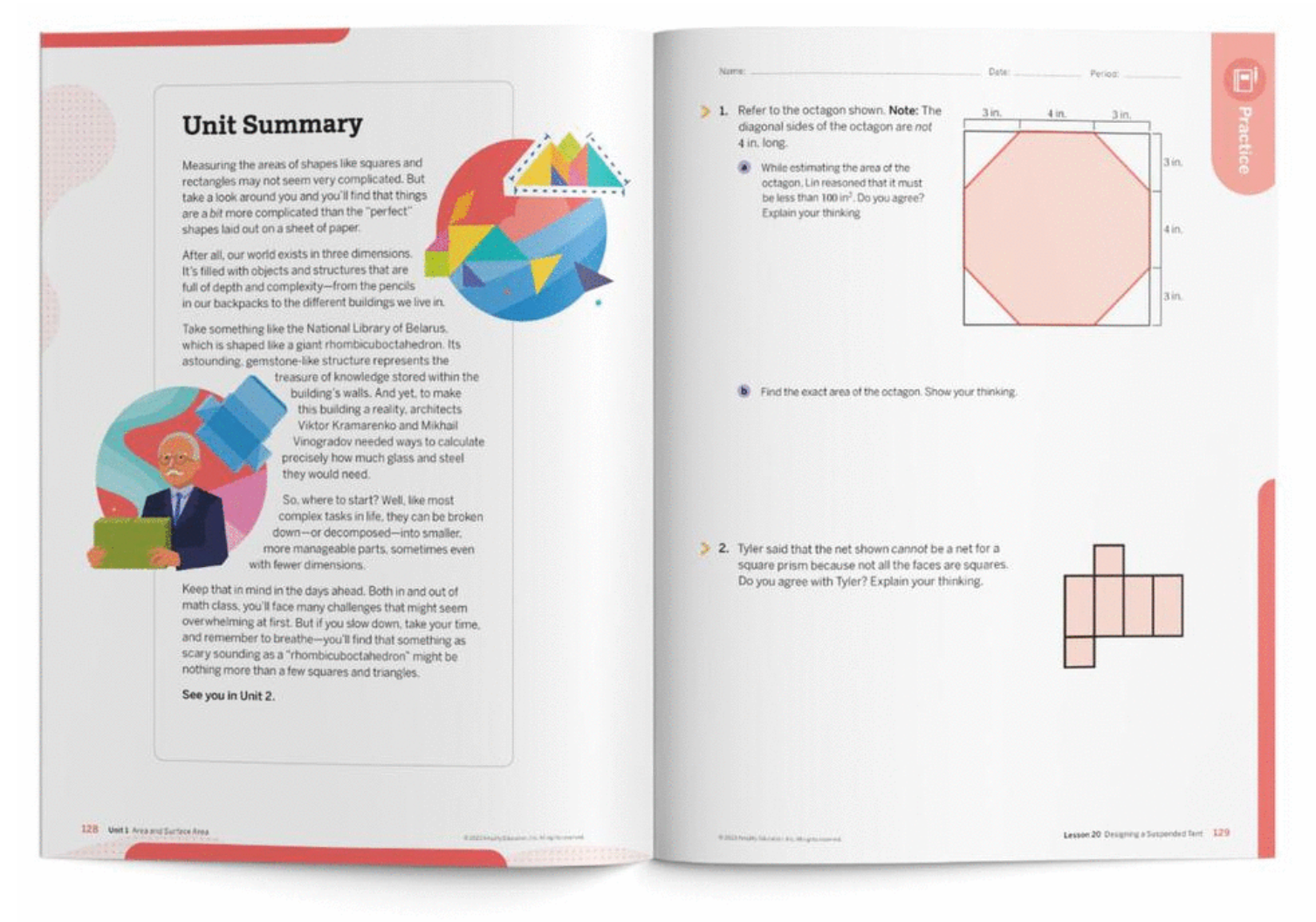
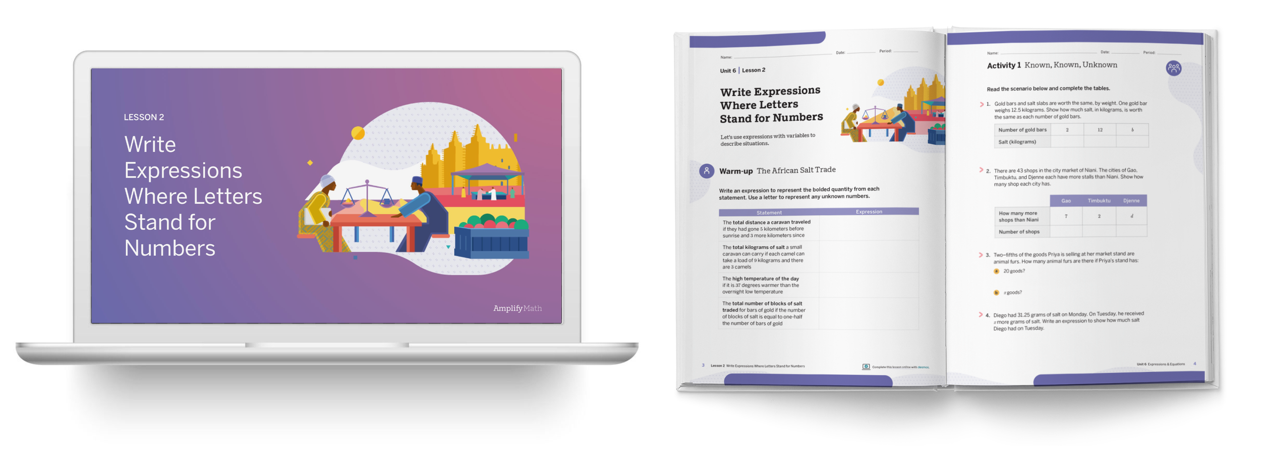
Amplify Math
Amplify partnered with Desmos to build social, collaborative curriculum for K-5 and middle school math, including online learning tools and workbooks.
Scope: Brand Identity refresh, Illustration, Wayfinding system design
Client: Amplify Math
Additional Credits: Todd Rawson (Design Director)

I worked with curriculum developers to refresh the visual system for Amplify Math grade bands (K-5, 6-8 and 9-11) to be implemented across its printed materials, as a compliment to the digital curriculum.
This includes updating the visual language and cover illustrations as well as the wayfinding system of labels for clearly and easily navigating printed materials.


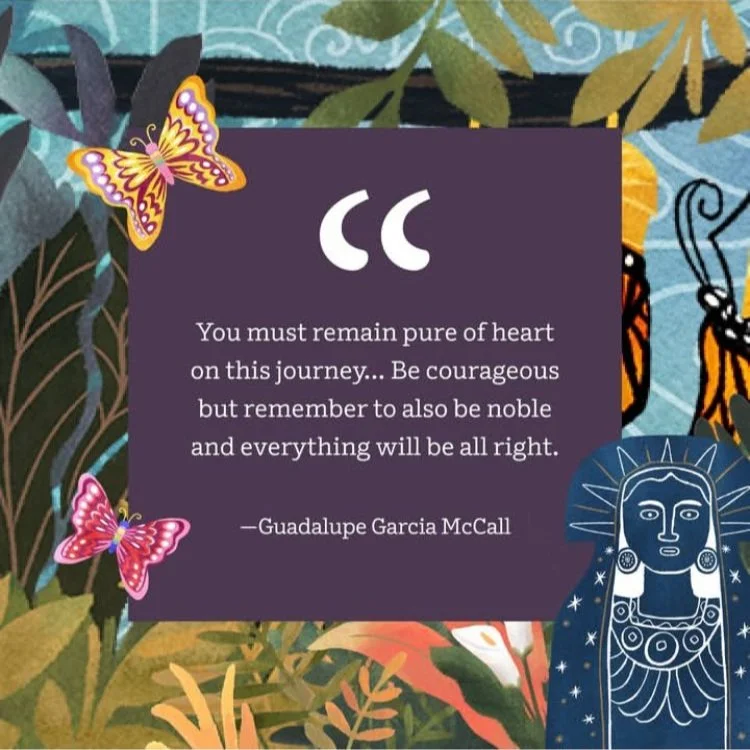
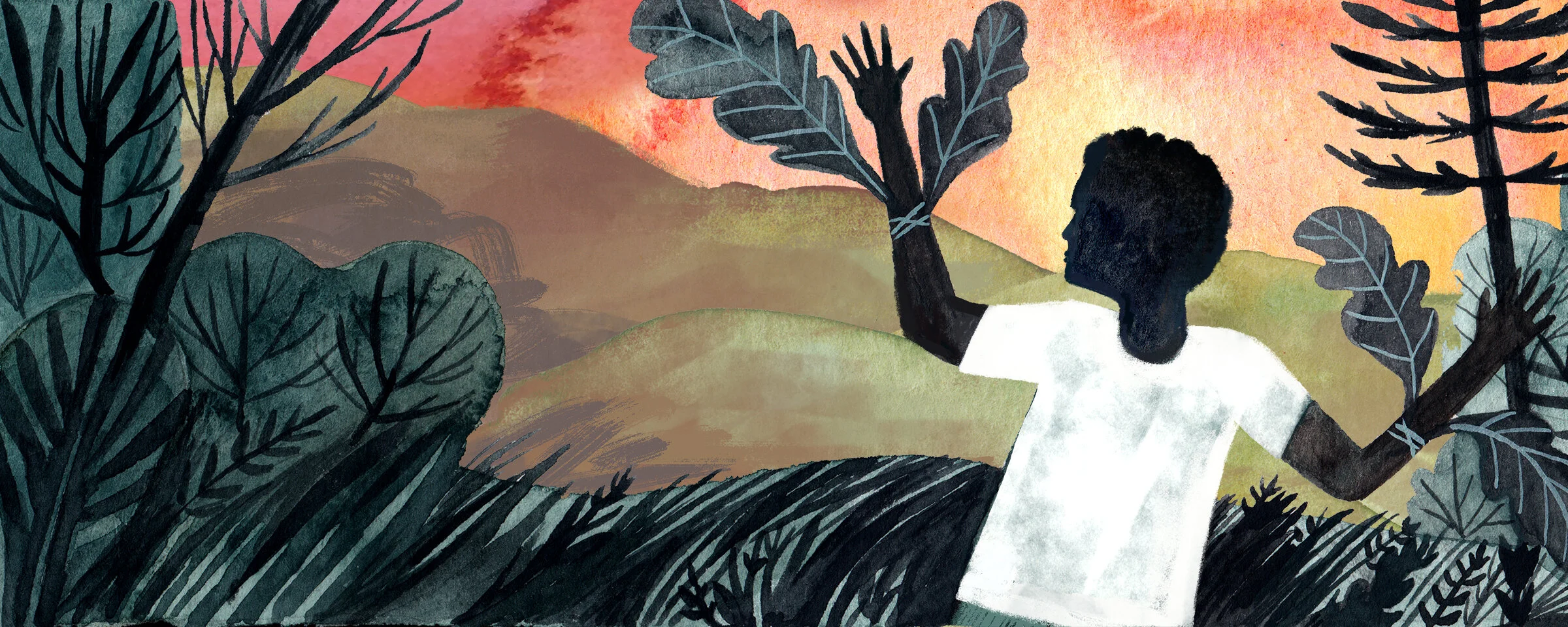
Amplify ELA: Summer of the Mariposas
Amplify ELA creates interactive core curriculum that inspires students to read more deeply, write more vividly, and think more critically. I collaborated with curriculum creators and editors, to create all the illustrations for this Reading the Novel unit.
Scope: Concept Art, Illustration, Layout, Social Media Templates
Client: Amplify ELA
Additional Credits: Tory Novikova (Art Director)