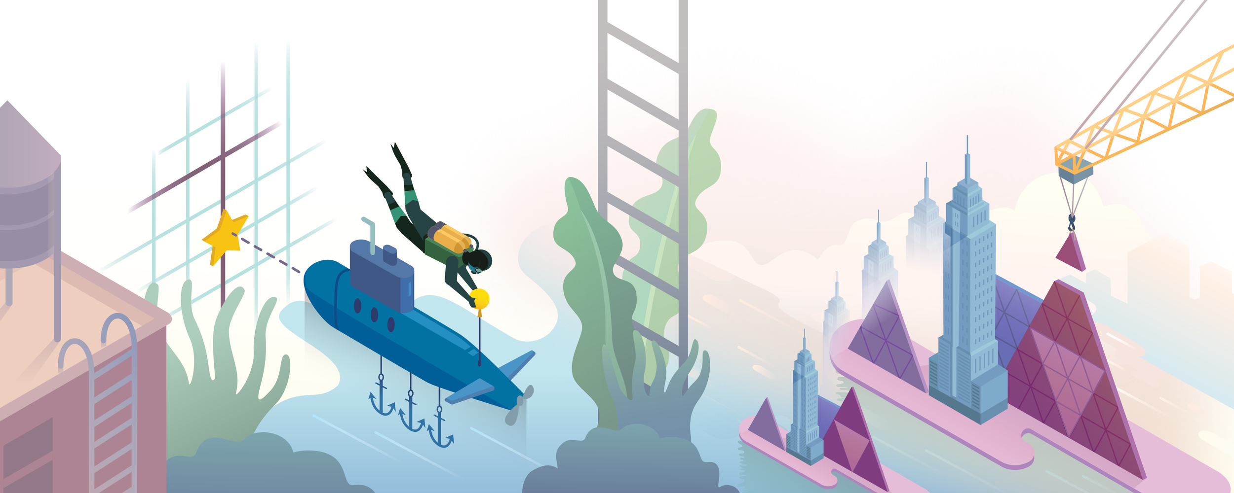
Work Samples
I value thoughtful, collaborative work, designed for connection and growth. My work uses storytelling to spark curiosity and moments of insight that inspire action.
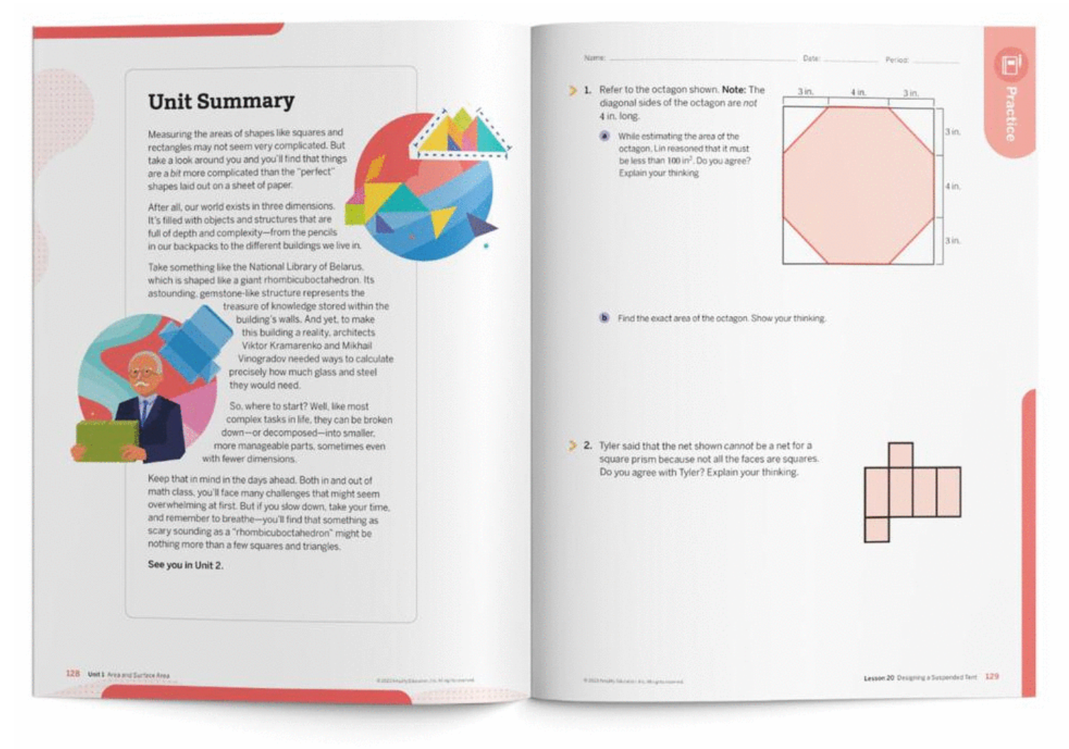
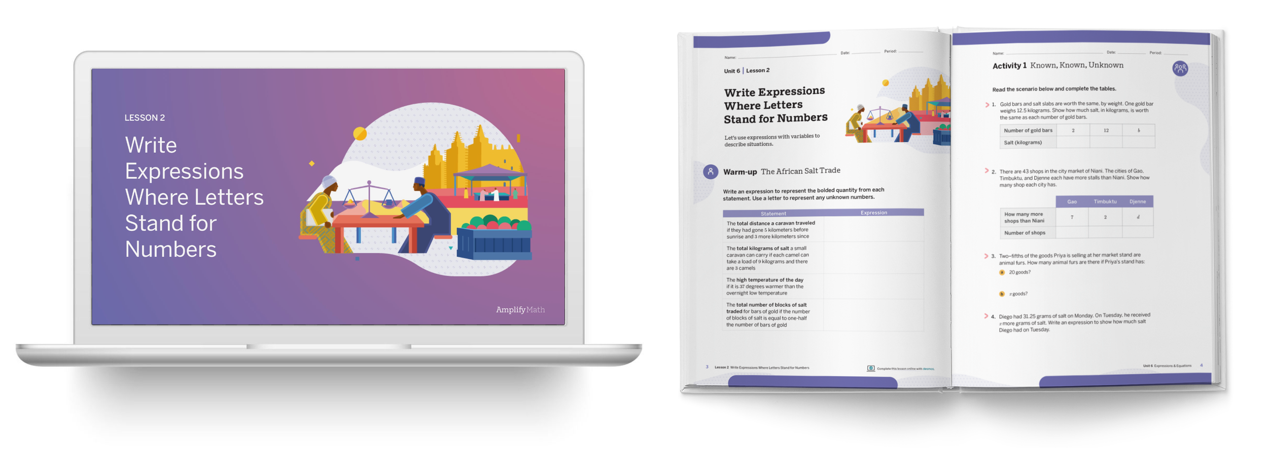
Amplify Math
Amplify creates interactive core curriculum that inspires students to learn in a fun, creative, and challenging way. They partnered with Desmos to build social, collaborative curriculum for K-5 and middle school math, including online learning tools and workbooks.
Scope: Brand Identity refresh, Illustration, Wayfinding system design
Client: Amplify Math
Additional Credits: Todd Rawson (Design Director)

I worked with curriculum developers to refresh the visual system for Amplify Math grade bands (K-5, 6-8 and 9-11) to be implemented across its printed materials, as a compliment to the digital curriculum.
This includes updating the visual language and cover illustrations as well as the wayfinding system of labels for clearly and easily navigating printed materials.


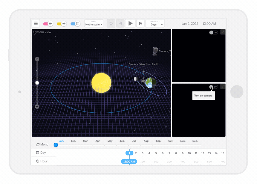
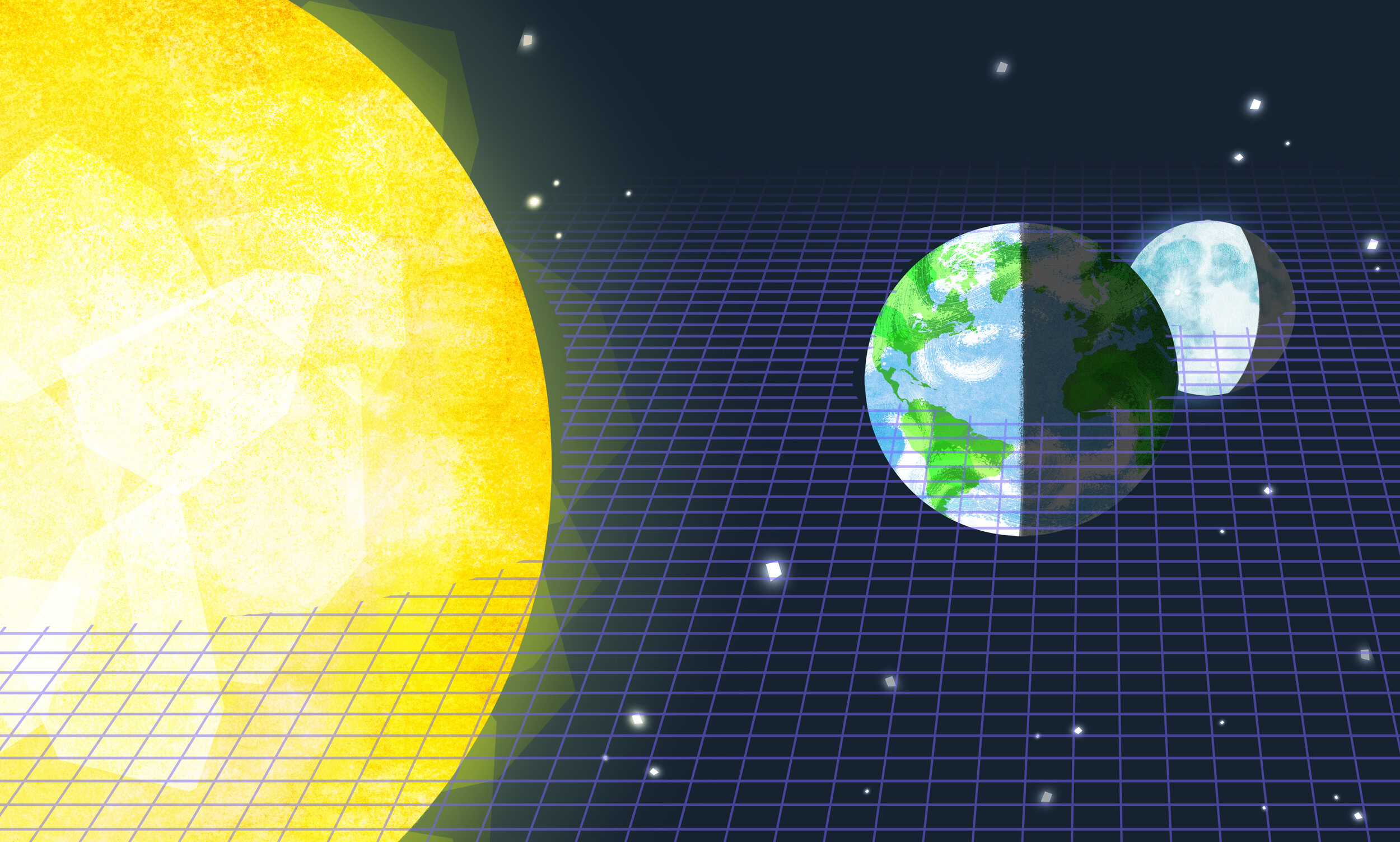
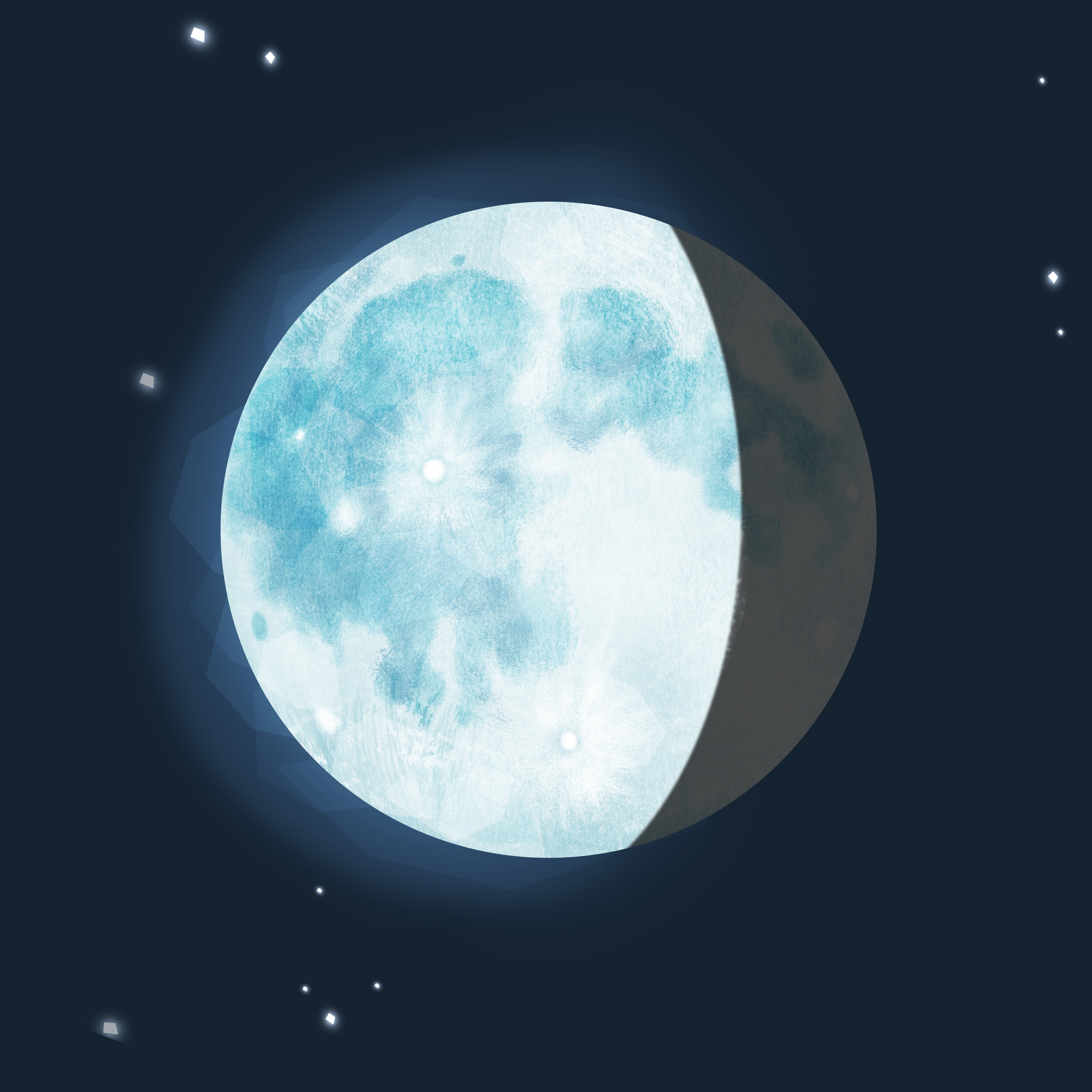
Amplify Science
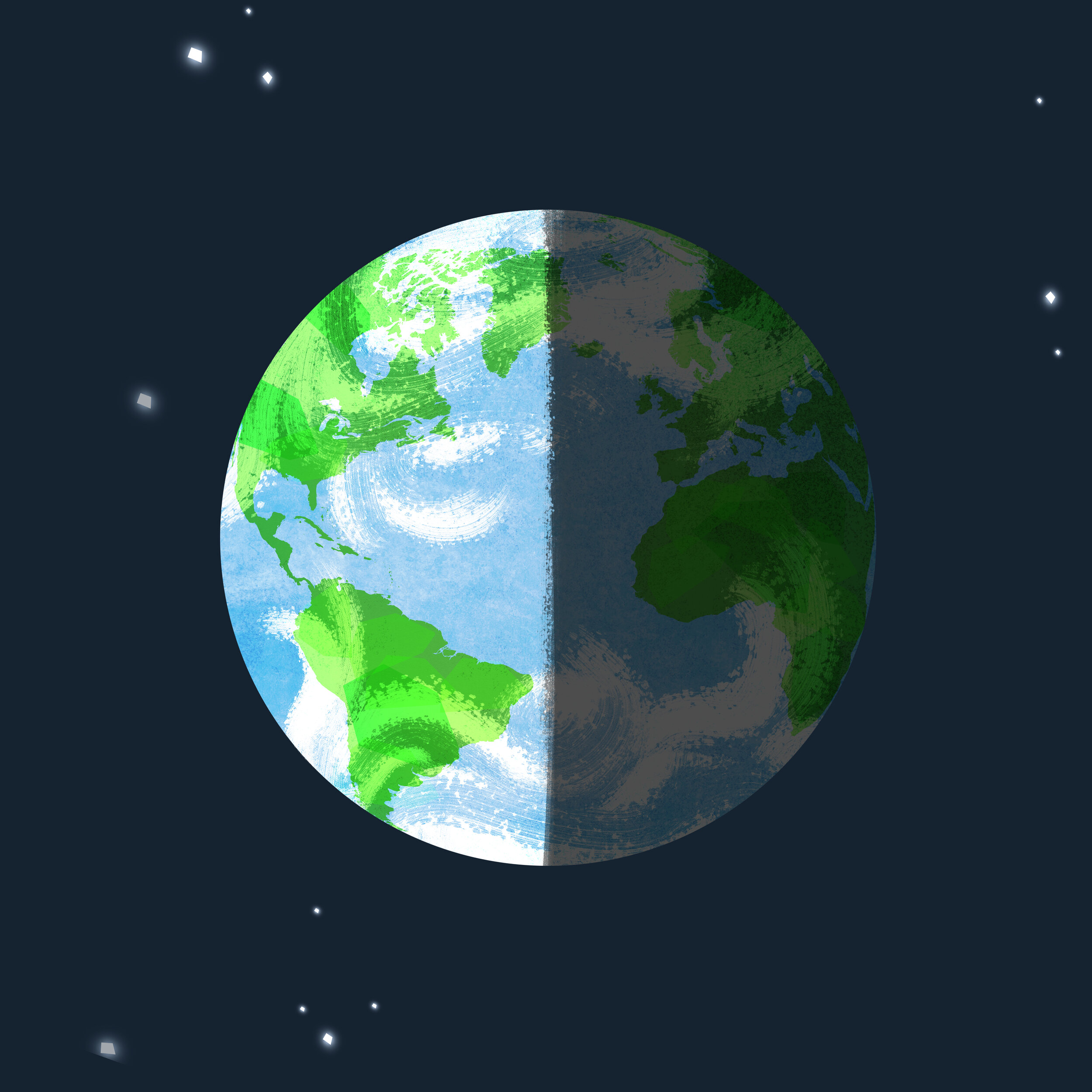
Amplify partnered with UC Berkeley’s Lawrence Hall of Science to create their digital Science curriculum. I worked with curriculum developers to design the user experience and look & feel for this Earth, Moon, Sun simulation app.
Scope: UI Design, Concept Art, Illustration
Client: Amplify Science
Additional Credits: Thomas Maher (Design Director)

We wanted to help students visualize how lunar and solar eclipses take place, through an intuitive and beautiful interactive simulation.
The League of Moveable Type
The League of Moveable Type is an open-source type foundry. We realized that there are a lot of free fonts out there, and as designers, we wanted to raise the standard of typography and design on the web.
Scope: Co-Founder, Product/Concept Development, Visual Identity, Type Design
Additional Credits: Micah Rich (Co-Founder)

We created an open-source type foundry where we focus on quality not quantity, to provide people with hand-picked high quality typefaces.

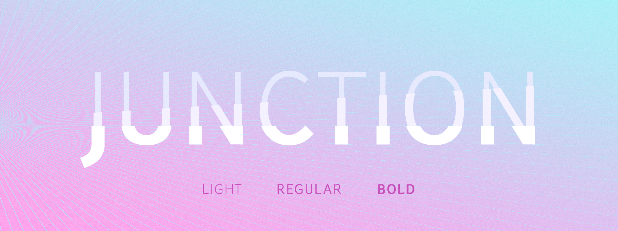
Junction
The very first typeface we added to The League's font library was Junction, a humanist sanserif typeface I’d designed.

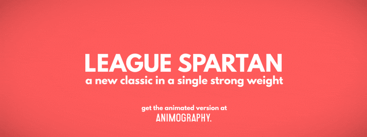
Revival typefaces
I designed two revival typefaces exclusively for The League’s catalogue: League Gothic & League Spartan, both are old classics and two of our favorite typefaces.
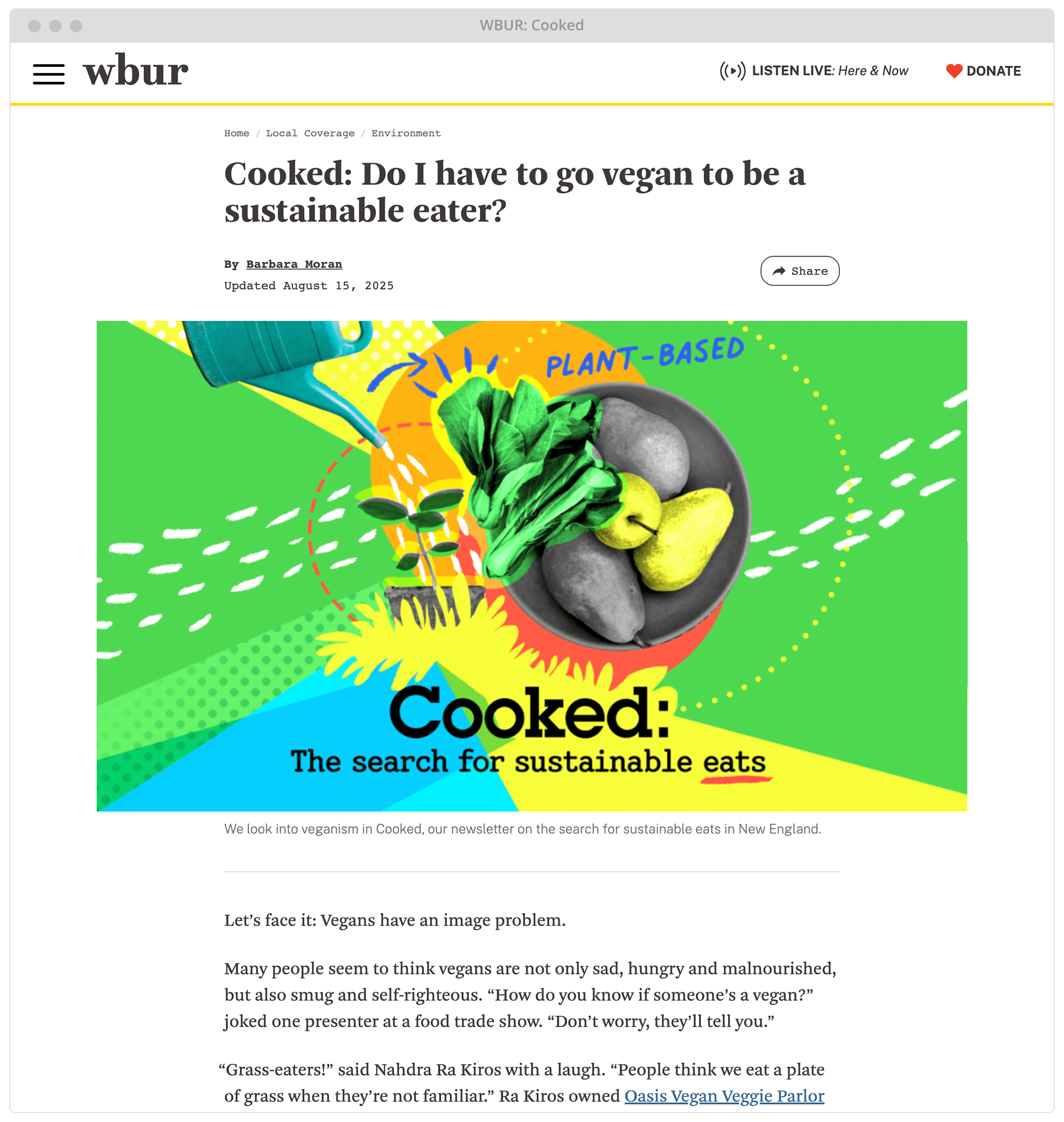
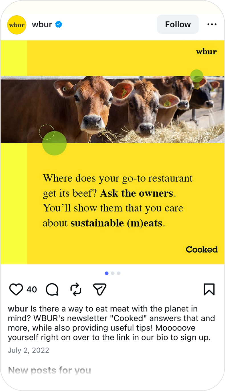
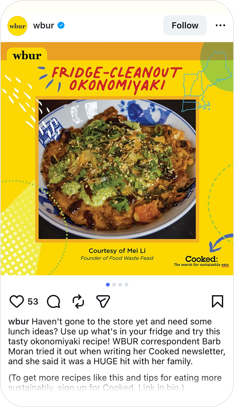
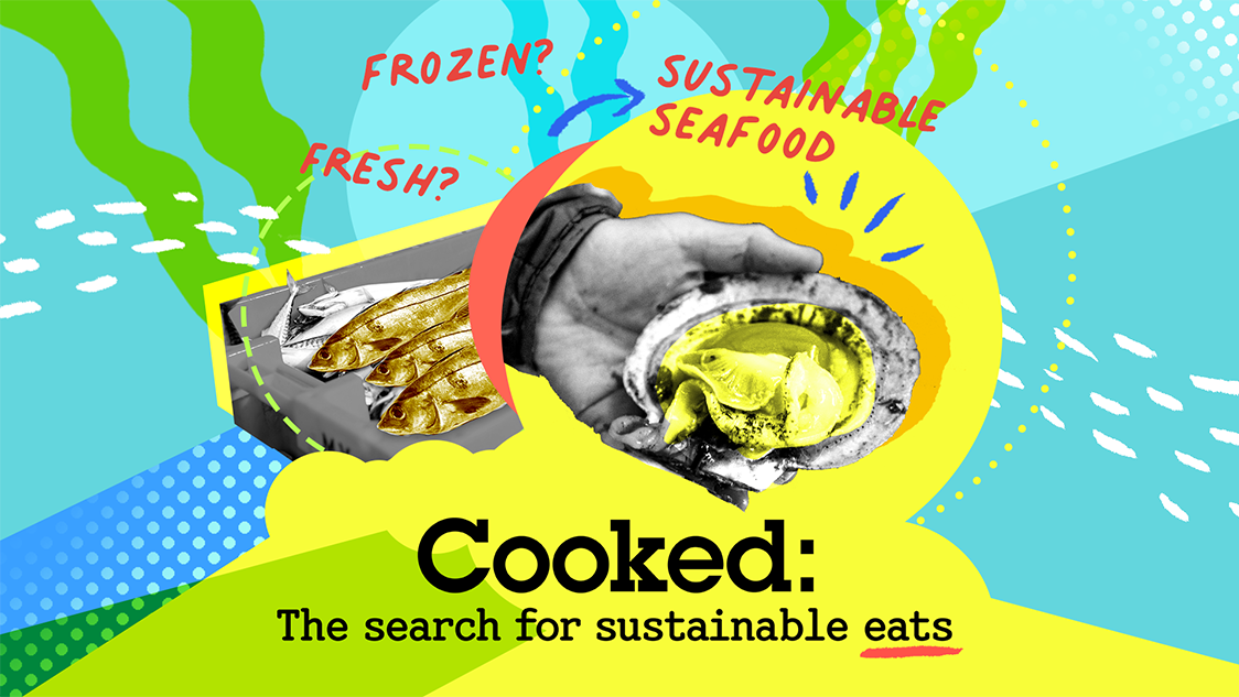
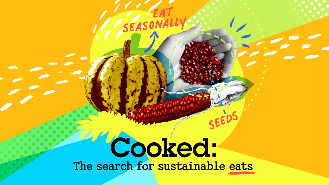
WBUR’s Cooked Newsletter
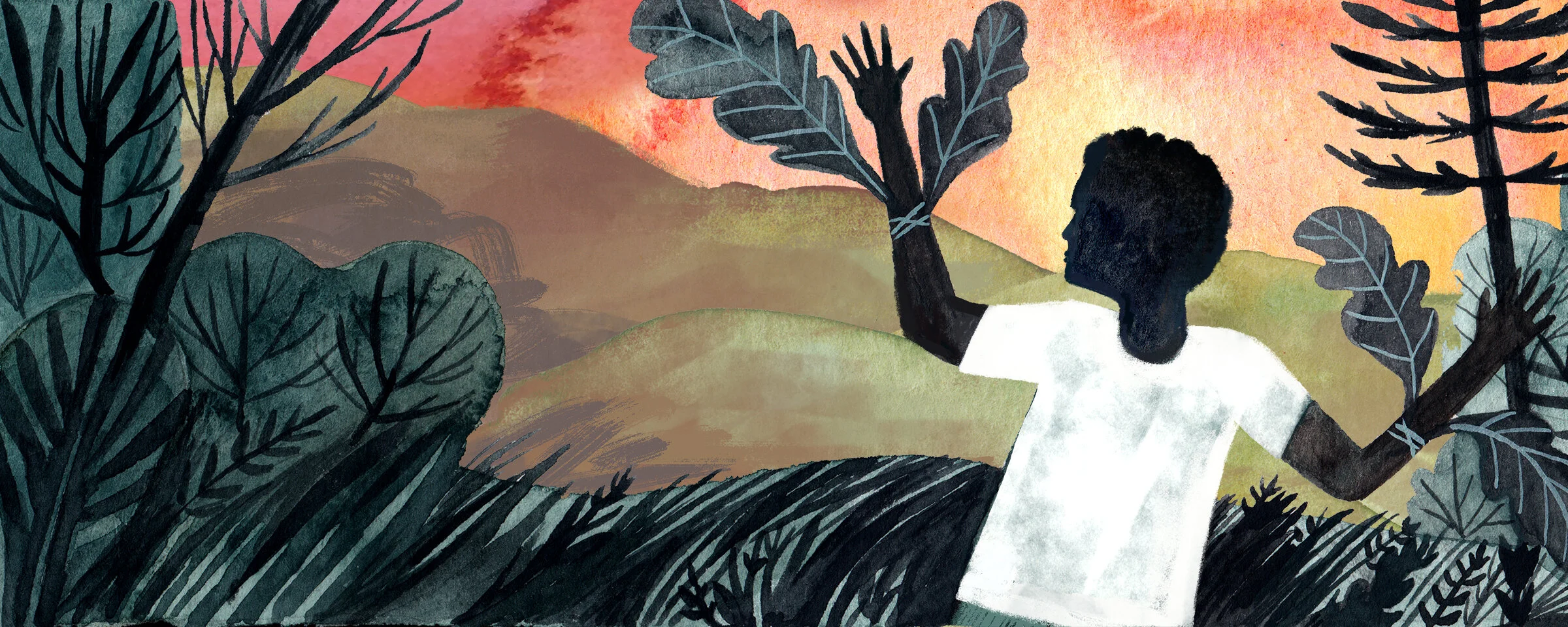
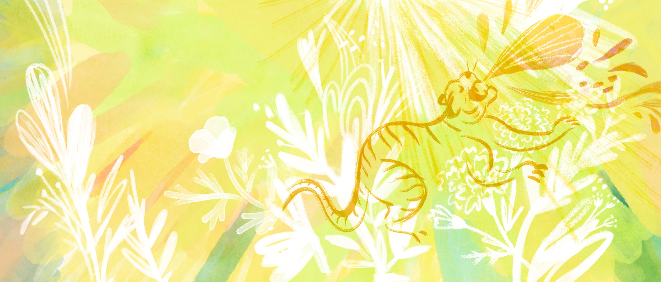
Cooked: The search for sustainable eats is a newsletter series from WBUR’s Environmental Team to help New England readers understand the environmental and social impact of what they eat. It gives readers advice, tips, recipes for making more sustainable choices.
Scope: Visual Identity/Branding, Logo Design, Social Media Strategy
Client: WBUR
Additional Credits: Meagan McGinnes (WBUR Senior Editor)
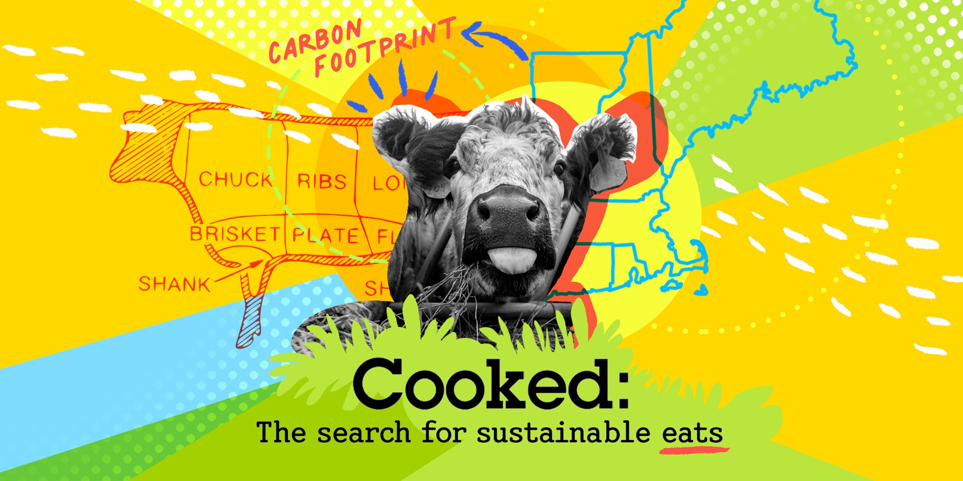
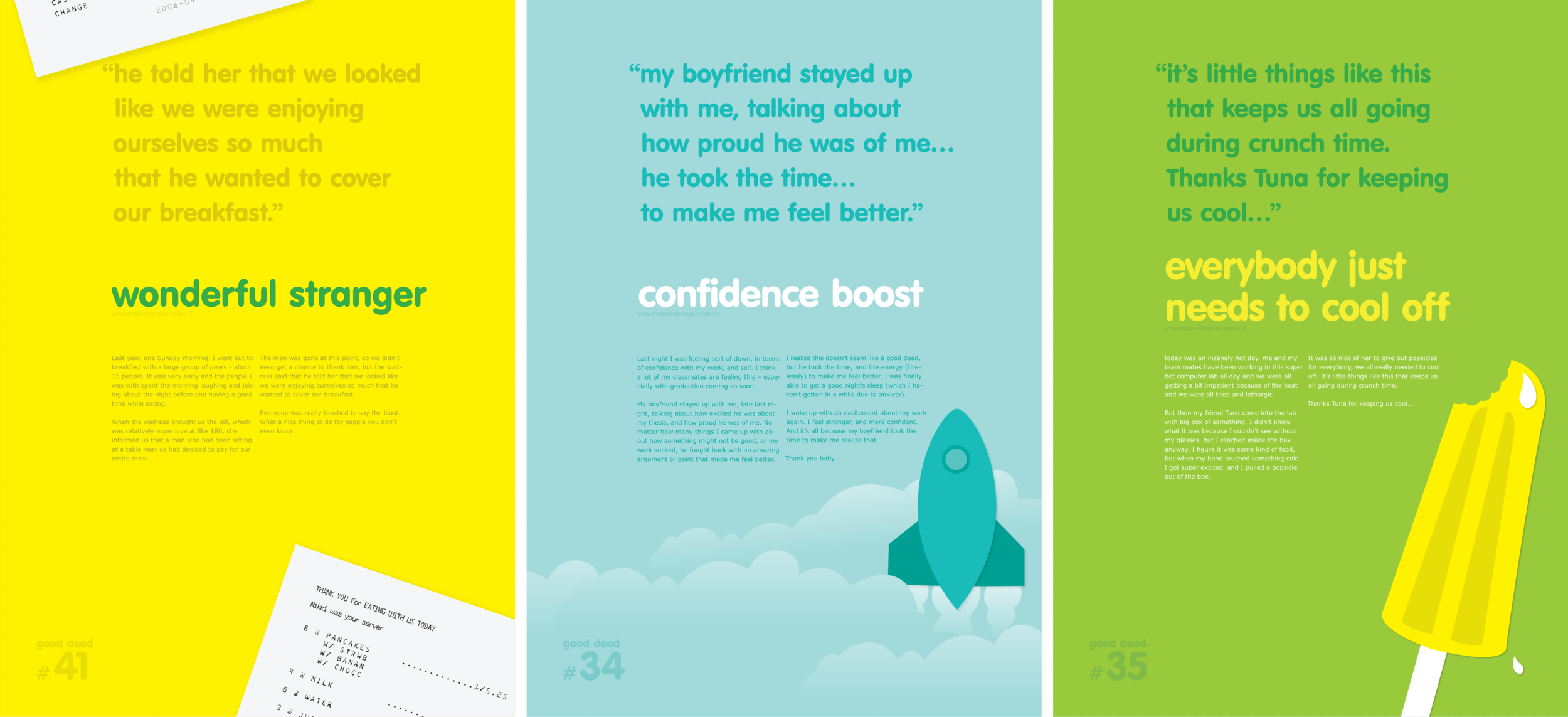
The Cooked series helps readers understand how to reduce their impact on climate change & take actionable steps so they can make a real difference

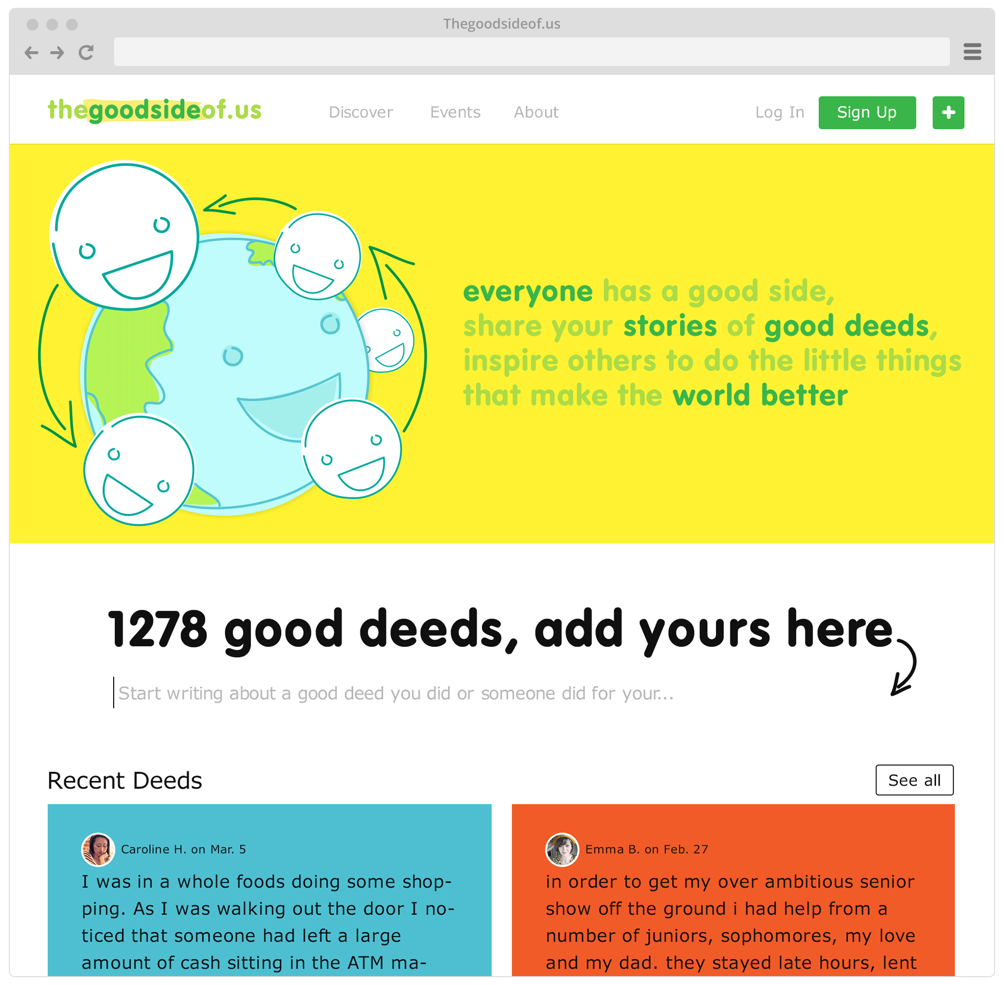
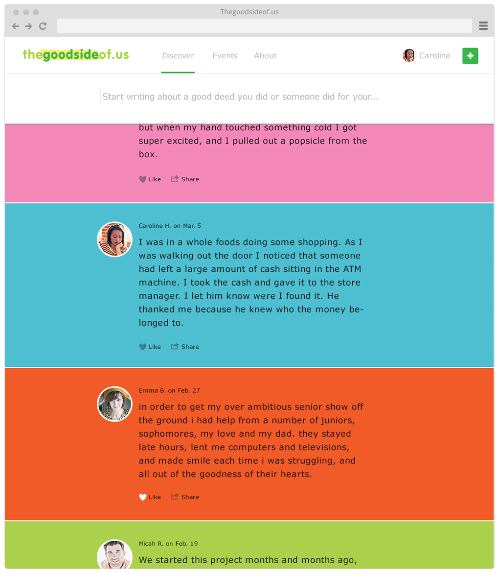
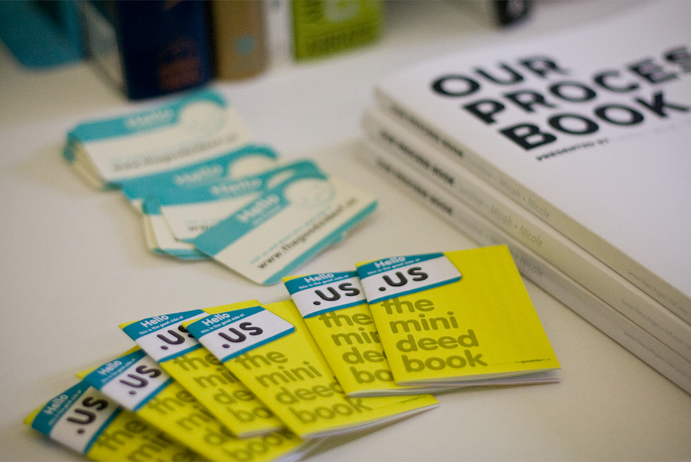
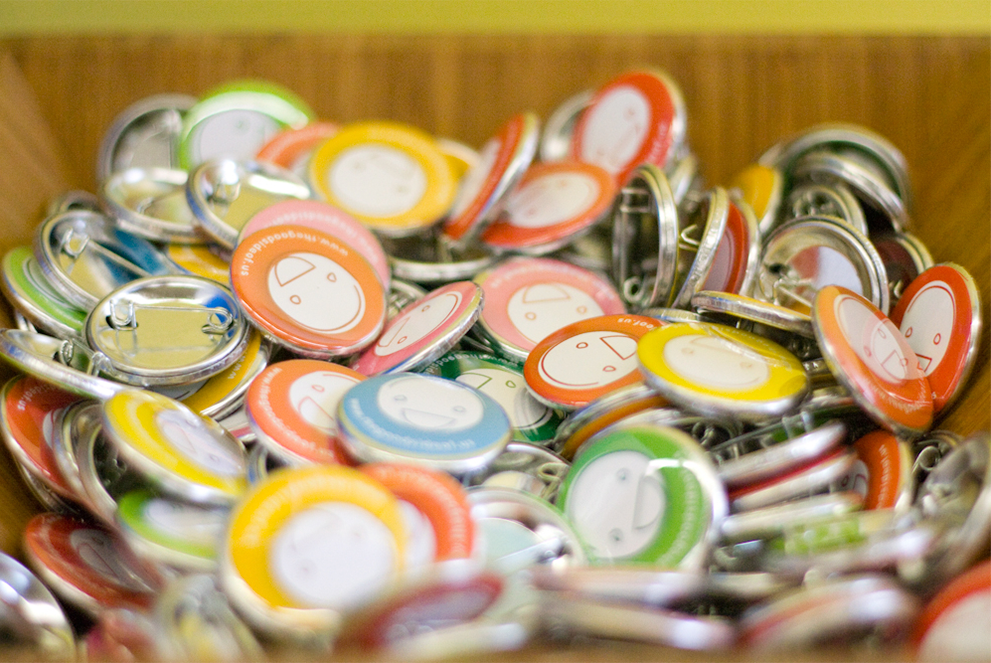
Thegoodsideof.us
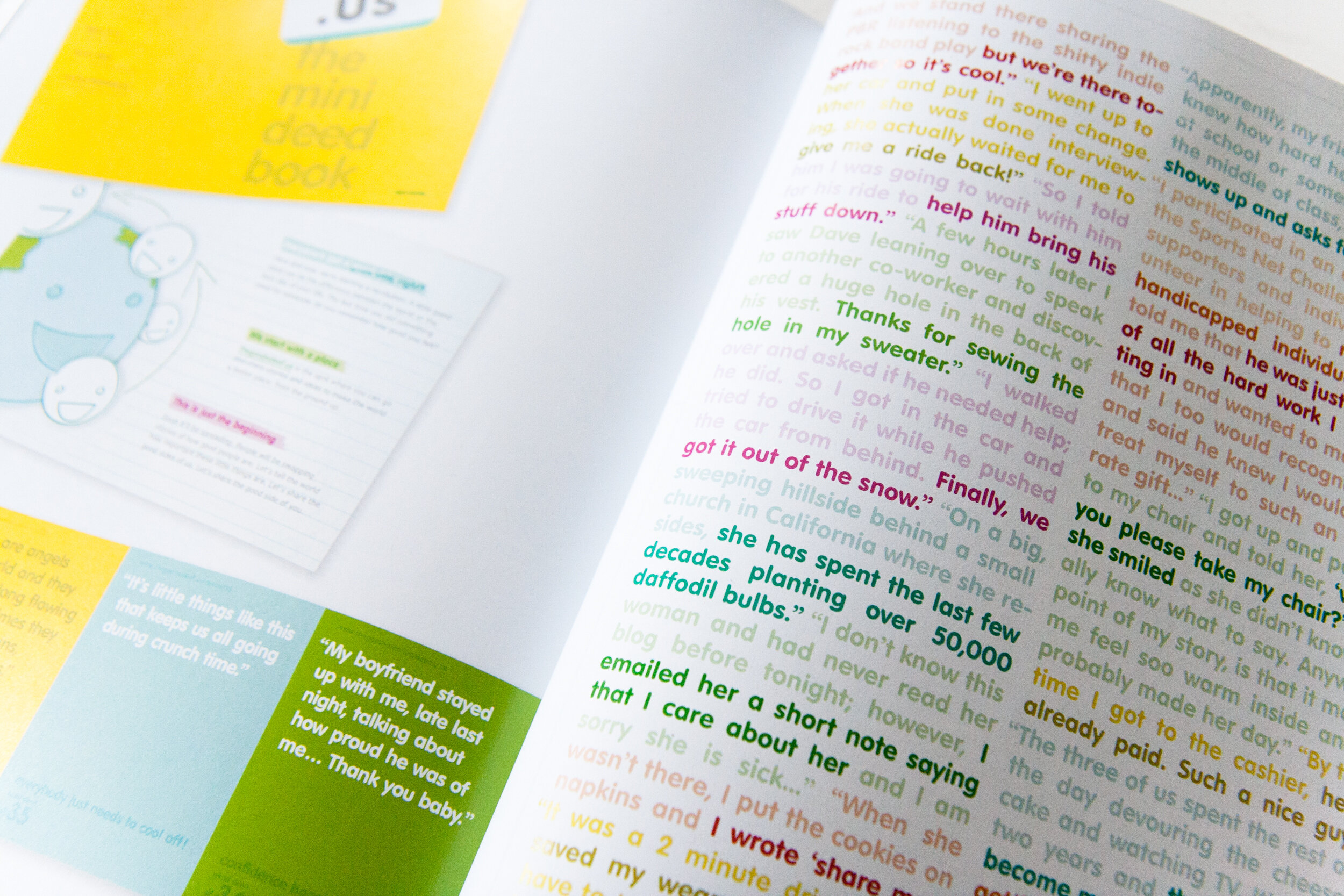
For this project, I collaborated with two fellow designers. We believe that designers have the power to create change, so we wanted to make something that could do some good in the world. We created thegoodsideof.us. As a website, it’s a place to share stories of little good deeds that people encounter daily. As an idea, it’s a revolution in what it means to make the world a better place.
Scope: Product/Concept Development, Brand Strategy, Visual Identity, UI Design, Event Coordination & Marketing
Community project: Otis College of Art & Design, Los Angeles, CA
Additional Credits: Micah Rich (Designer/Web Developer), Nicole Week (Designer)