WBUR’s Cooked Newsletter
Making climate journalism feel closer to home
Client: WBUR
Role: Designer
Scope: Visual Identity, Logo Design, Social Media Design
Additional Credits: Meagan McGinnes, WBUR Senior Editor
Cooked: The search for sustainable eats is a newsletter series from WBUR’s Environmental Team that helps New England readers understand the environmental and social impact of what they eat, with practical advice, tips, and recipes for making more sustainable choices.
The series focuses on actionable steps readers can take in their everyday lives, making a complex issue like climate change feel more tangible and less overwhelming.
I developed a playful, approachable visual identity and flexible social media toolkit that could support a range of stories about food, sustainability, and climate across the newsletter and its promotional materials.
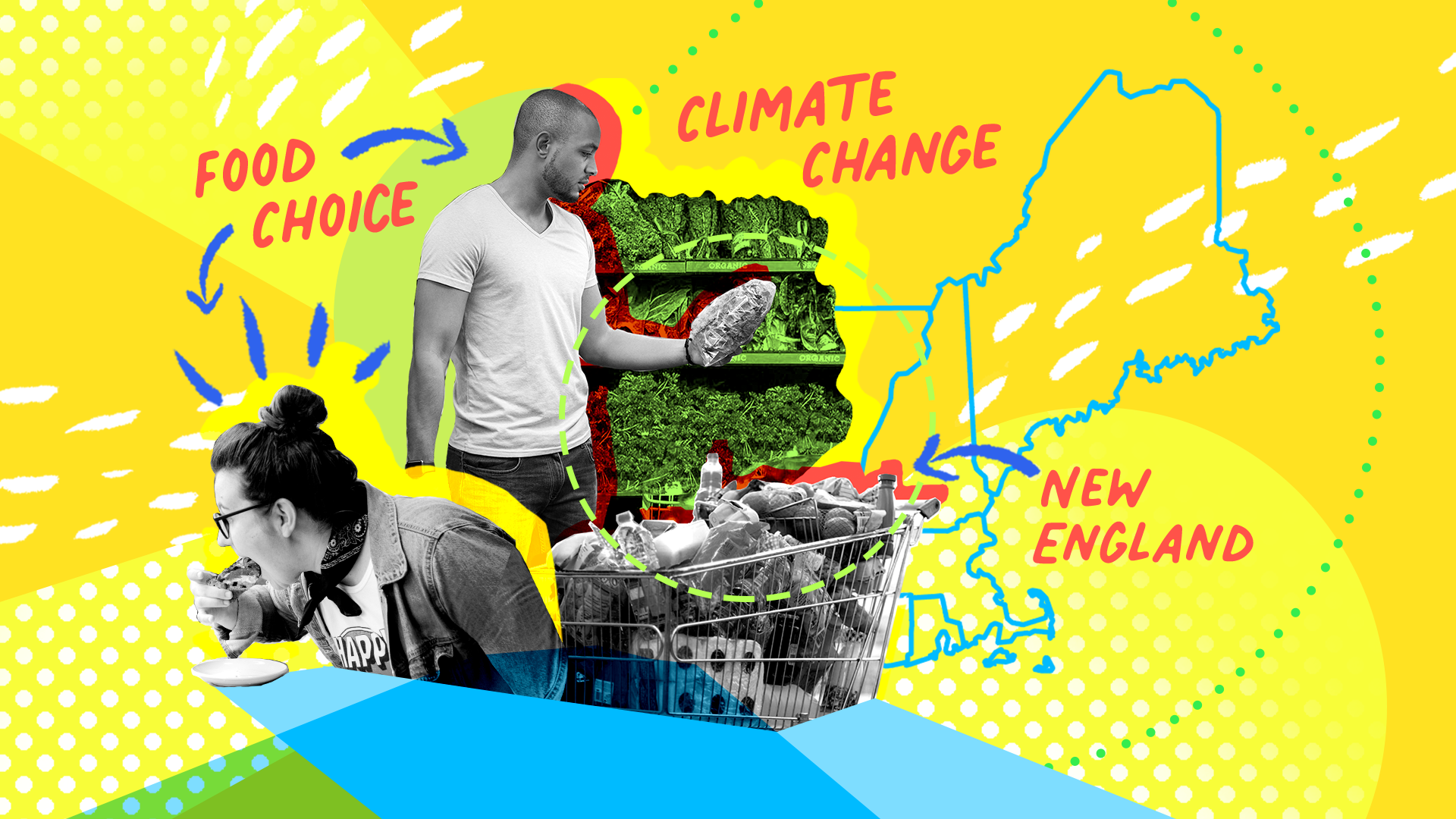
Making a big issue feel approachable
Climate change can feel enormous and abstract. Cooked takes a more practical approach, focusing on something familiar and personal: the food we eat and the choices we make every day.
The visual identity needed to reflect that spirit—informative and engaging without losing sight of the seriousness of the subject.
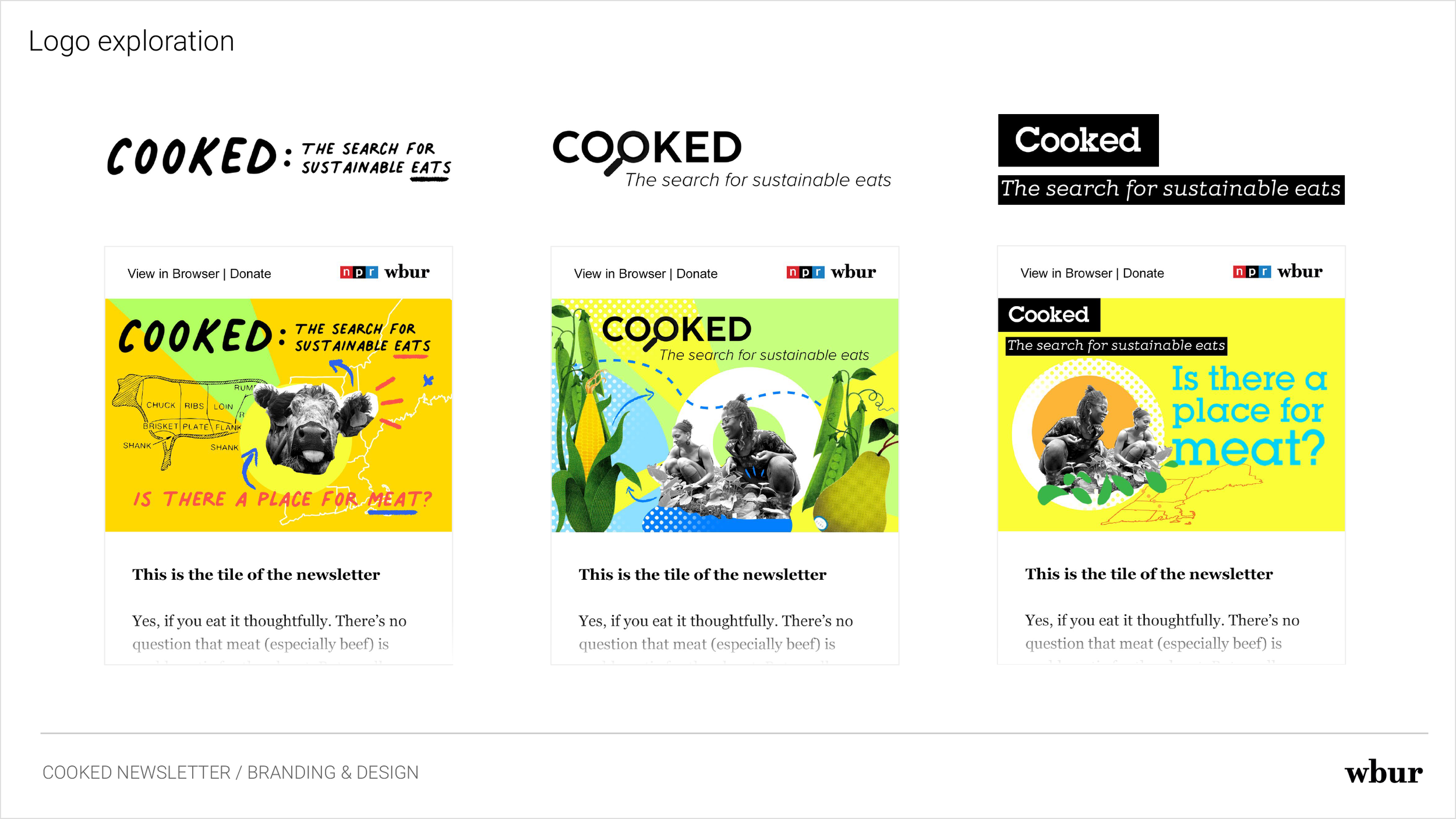
I explored a range of directions for the Cooked identity and logotype, looking for an approach that could make complex information feel accessible and actionable.
Here are some early iterations of the logotype and design directions.
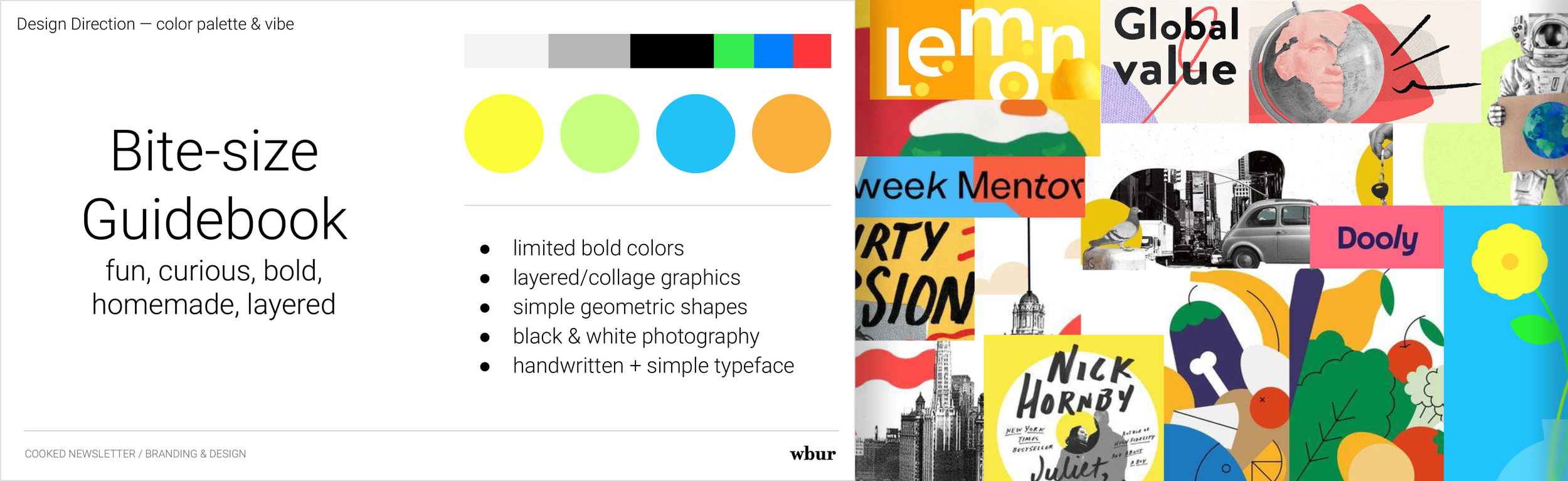
The “Bite-size Guidebook”
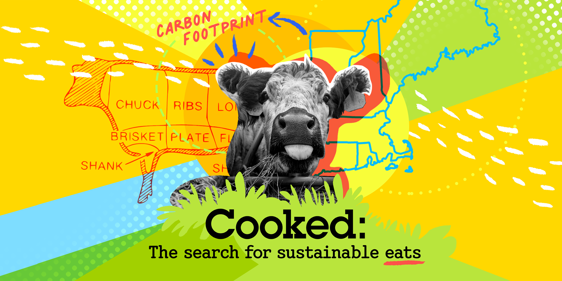
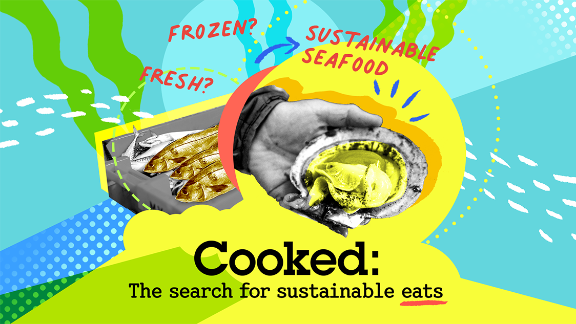
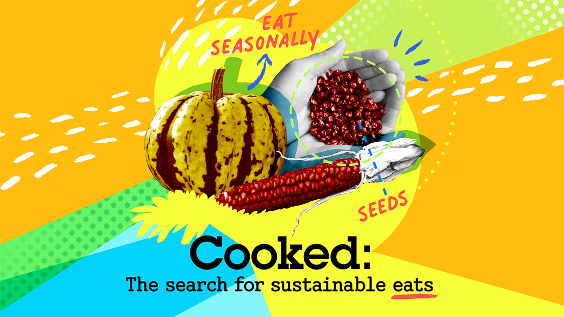
The final design direction, “Bite-size Guidebook,” takes inspiration from the handmade, layered quality of a researcher’s field notes and DIY guides. The visual language combines original editorial photography from each story—treated in black and white—with bright colors, bold graphic elements, and handwritten typography to create a playful collage aesthetic.
Because Cooked covers a wide range of stories and subjects, the system needs to be flexible. Photography and graphic elements can be mixed, layered, and rearranged to suit each story while maintaining a recognizable visual identity across the newsletter and supporting promotional materials, including printed postcards and social media templates.
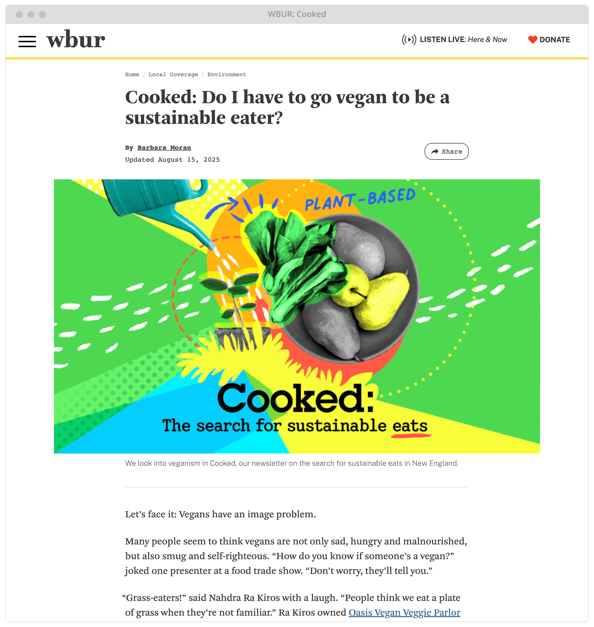
Bringing the stories to social
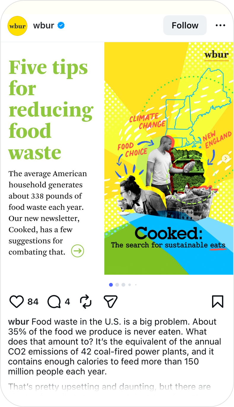
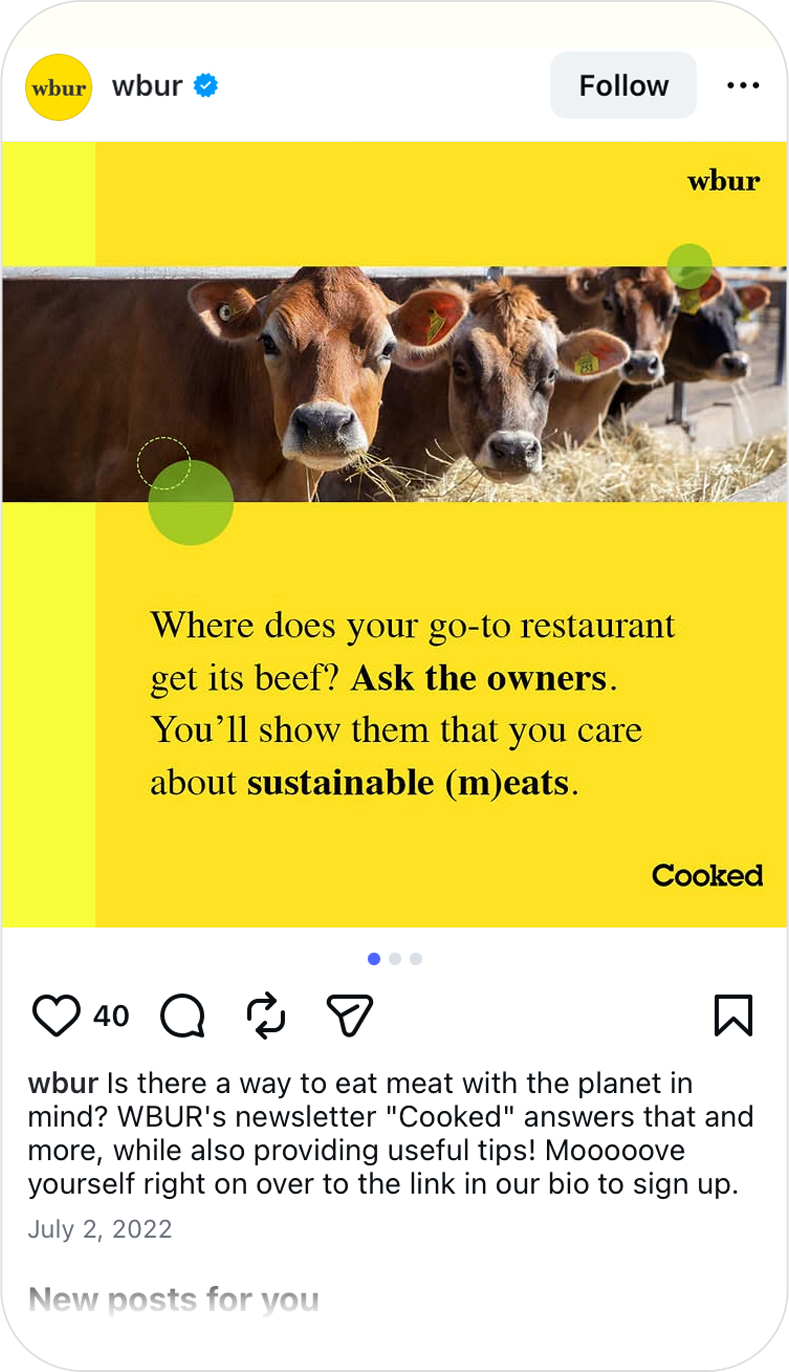
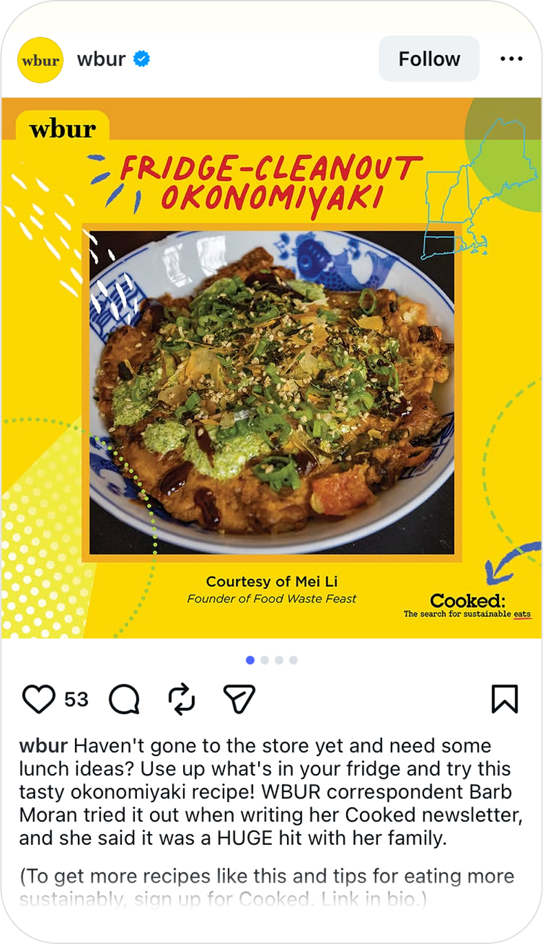
I extended the visual language to social media, creating a flexible social media toolkit that paired elements from the Cooked identity with WBUR’s original photography to create graphics for individual stories.
The flexible system allowed each story to have its own visual expression while remaining immediately recognizable as part of the larger Cooked series.