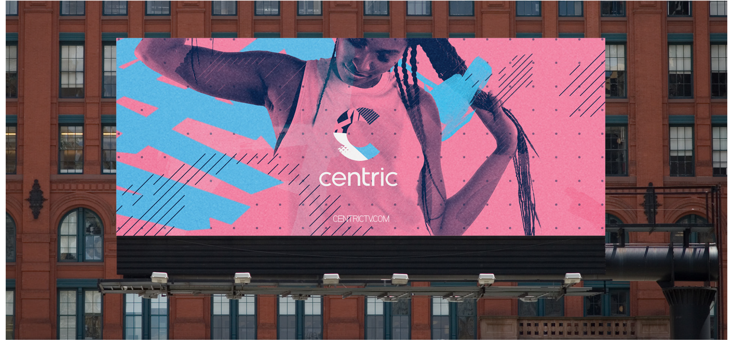
Centric Styleguide
Turning a layered identity into a clear system
Client: Centric / BET Networks
Role: Designer
Studio: Gretel
Scope: Style Guide Design, Layout Design
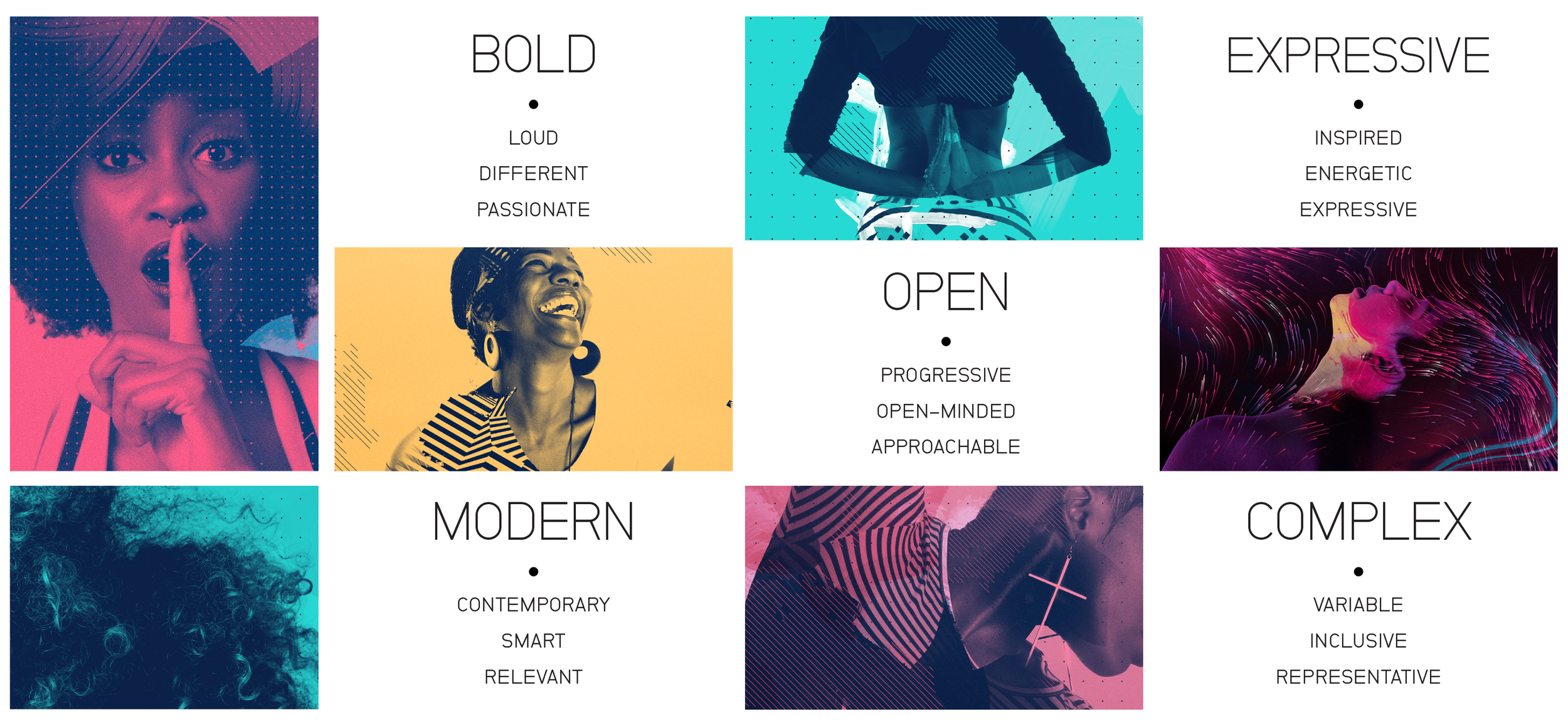
Centric was a music and entertainment network evolving into a modern lifestyle brand created for Black women. Gretel developed a rich, layered visual identity built from color, pattern, texture, typography, and imagery.
I was brought in to translate that identity into a comprehensive style guide for Centric’s in-house design team, organizing its many components, combinations, and rules into a system that was clear, cohesive, and easy to use.
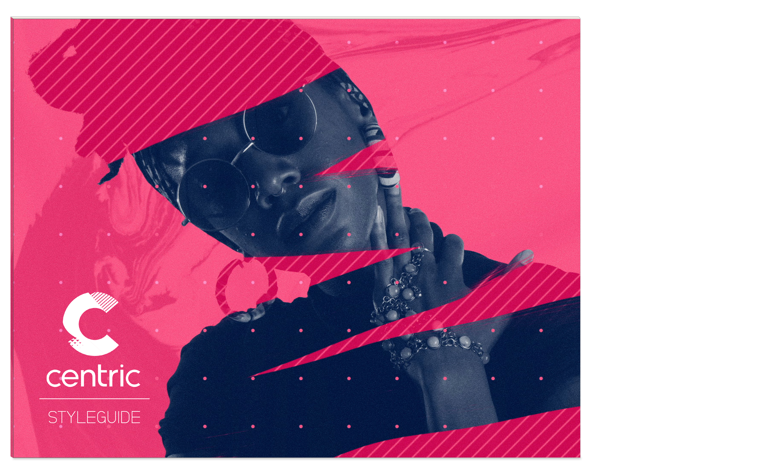
Making complexity easy to navigate
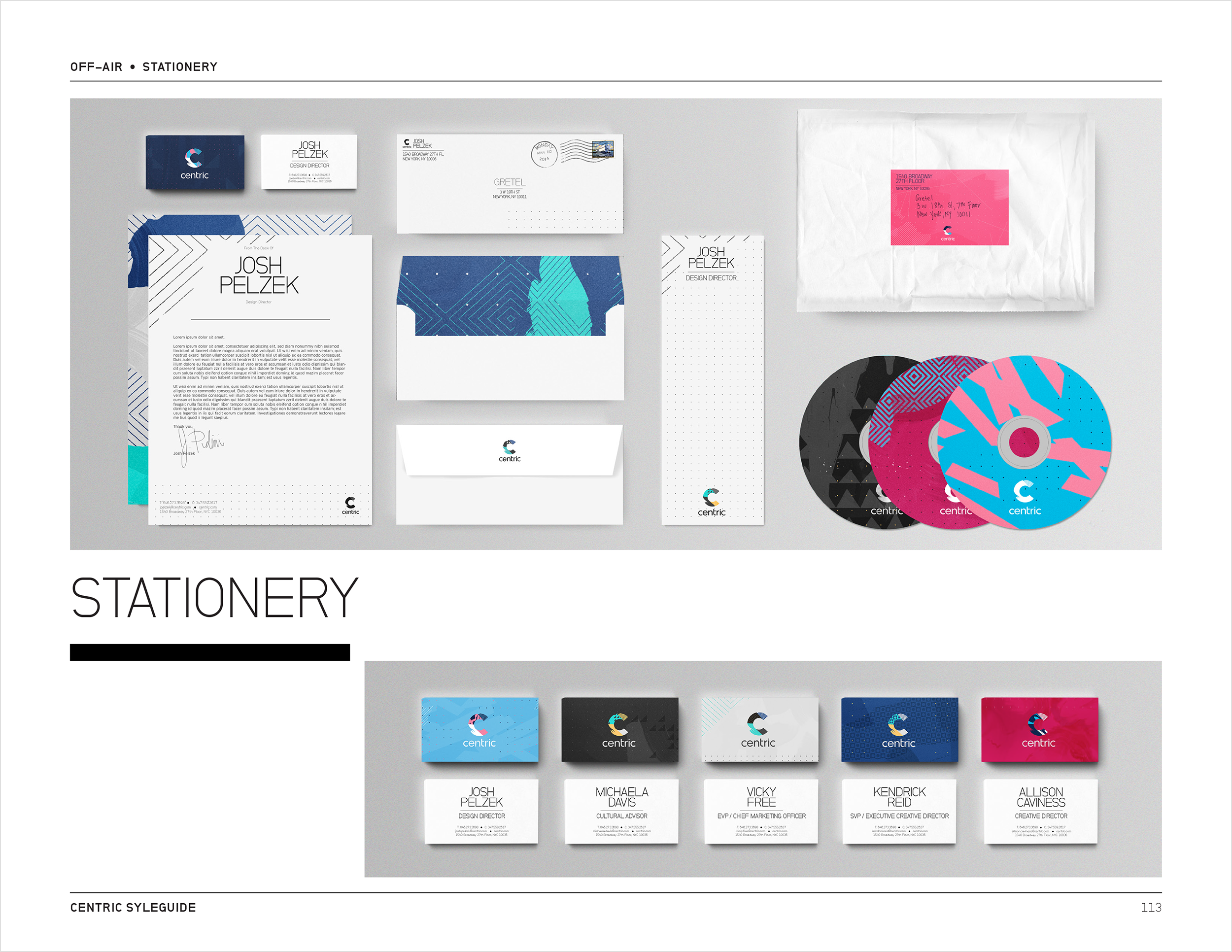
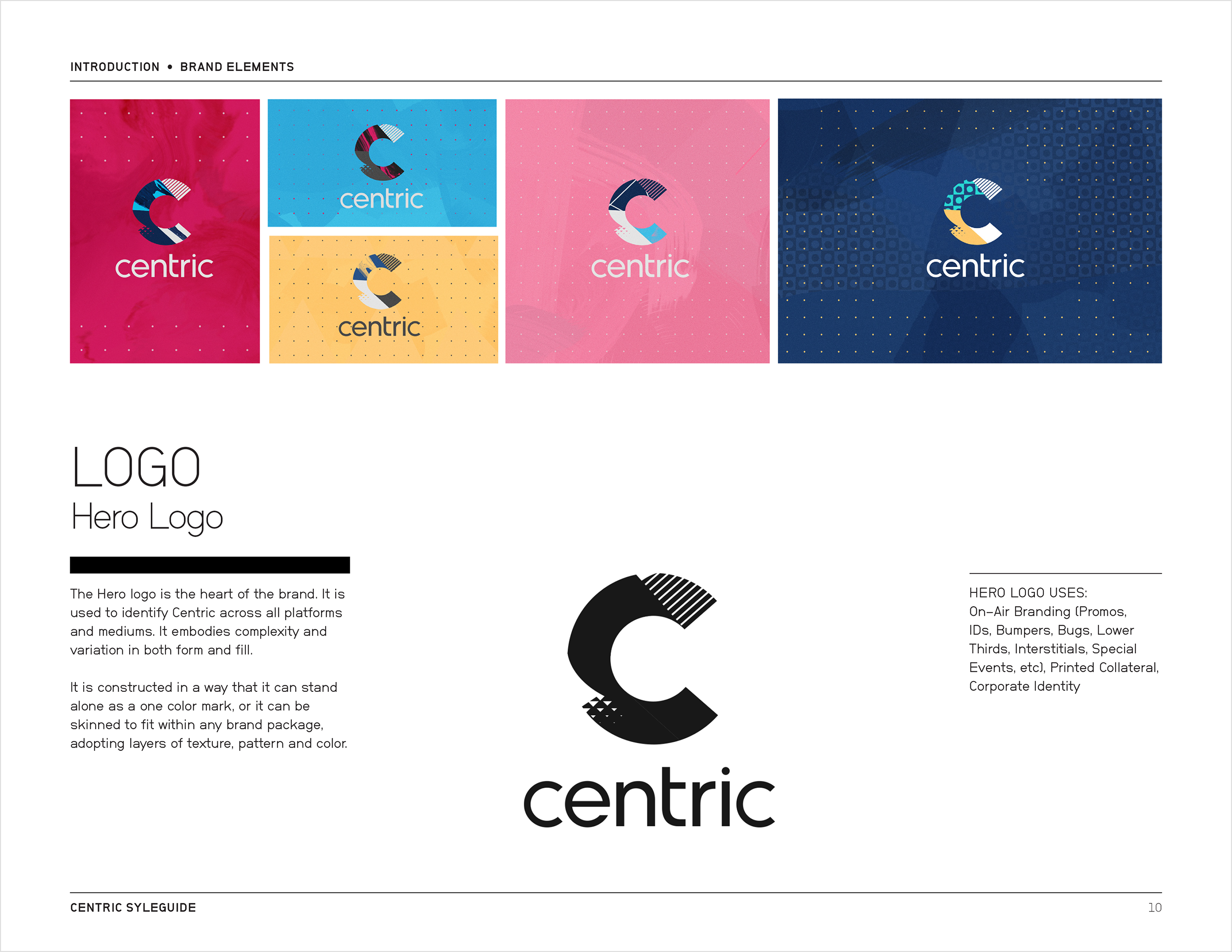
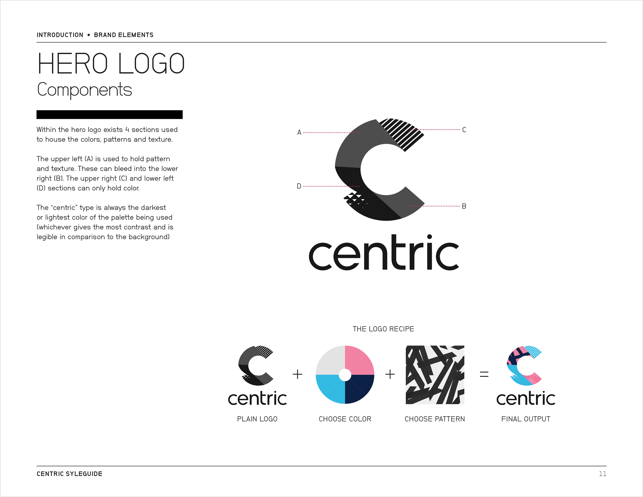
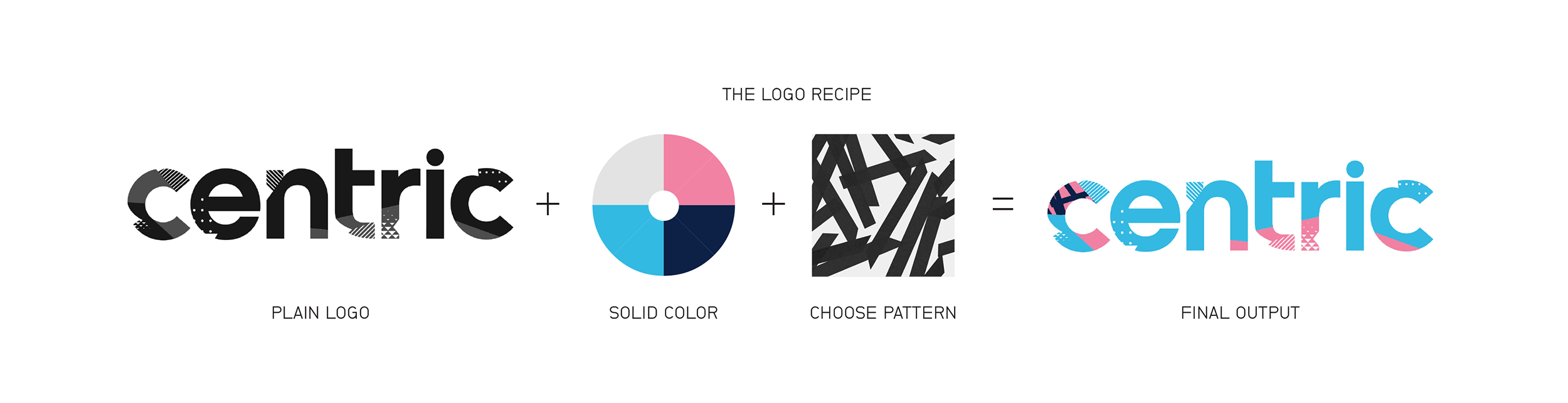
The guide documented everything from logo lockups and color palettes to patterns, textures, typography, and rules for combining the identity’s different visual components.
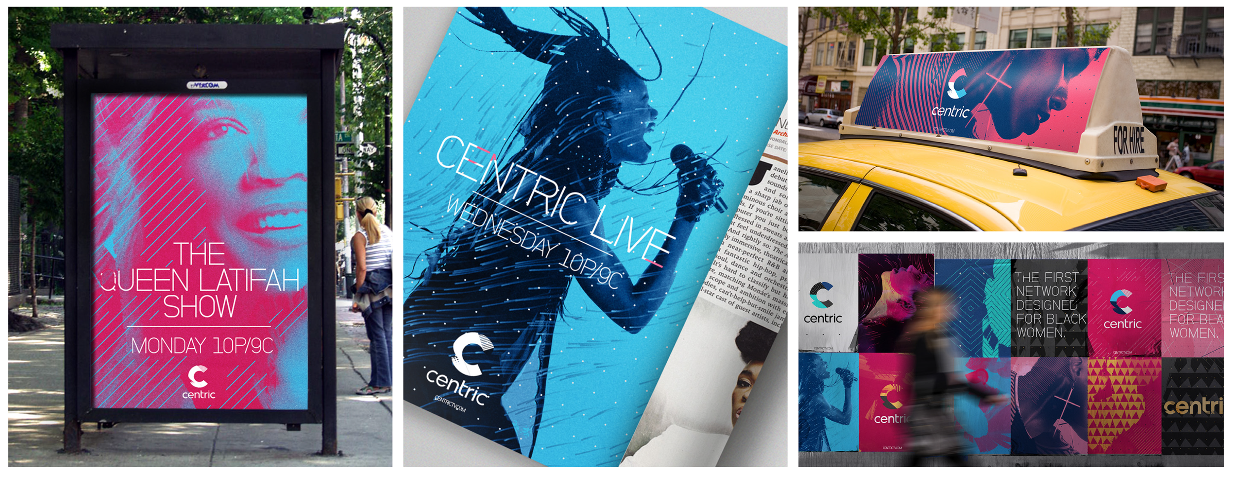
The final guide gave Centric’s design team a single reference for applying the identity across programming and promotional materials.
One Formula, Many Possibilities
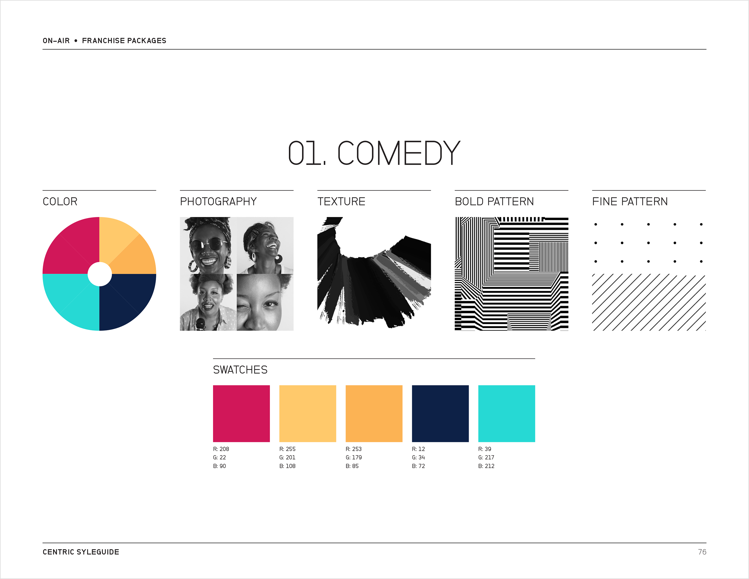
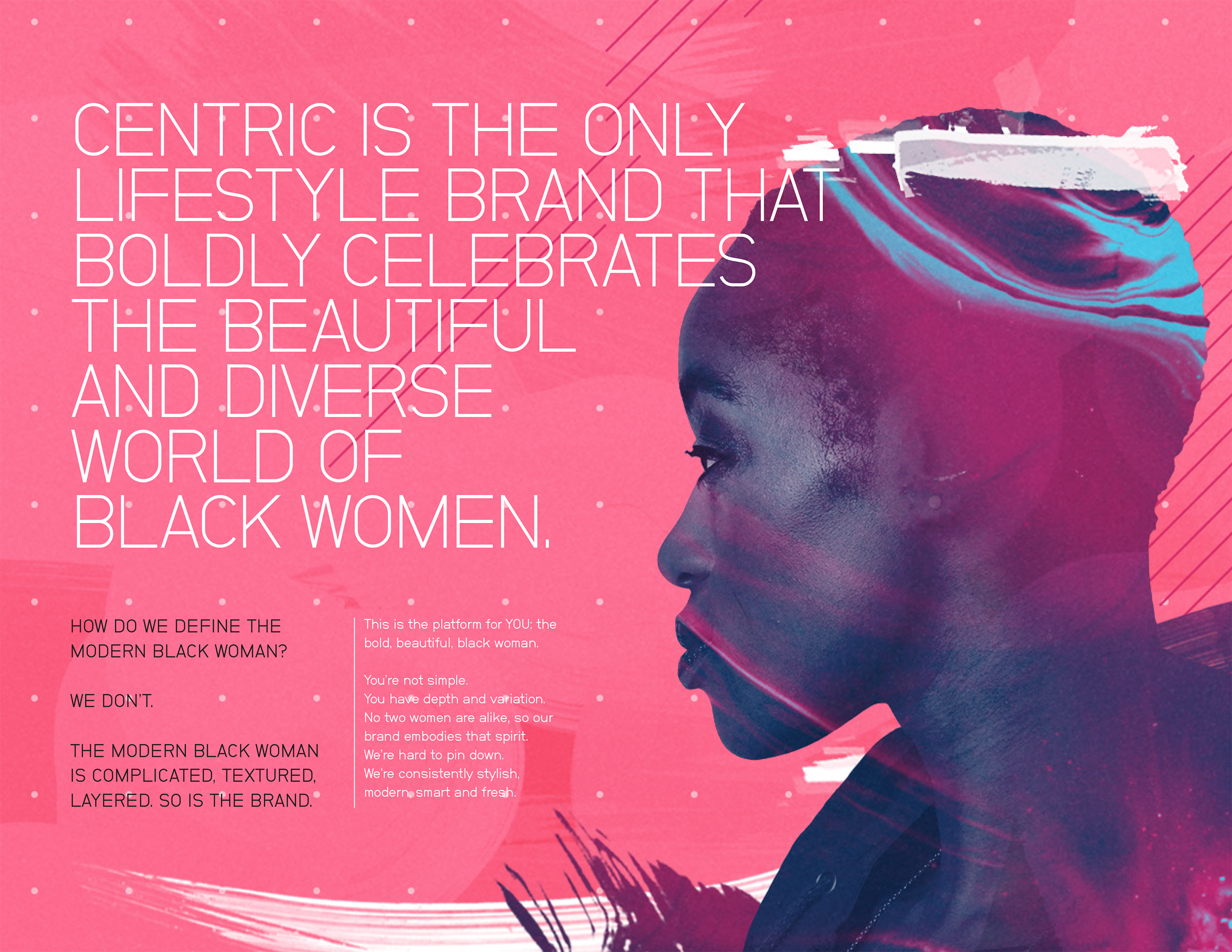
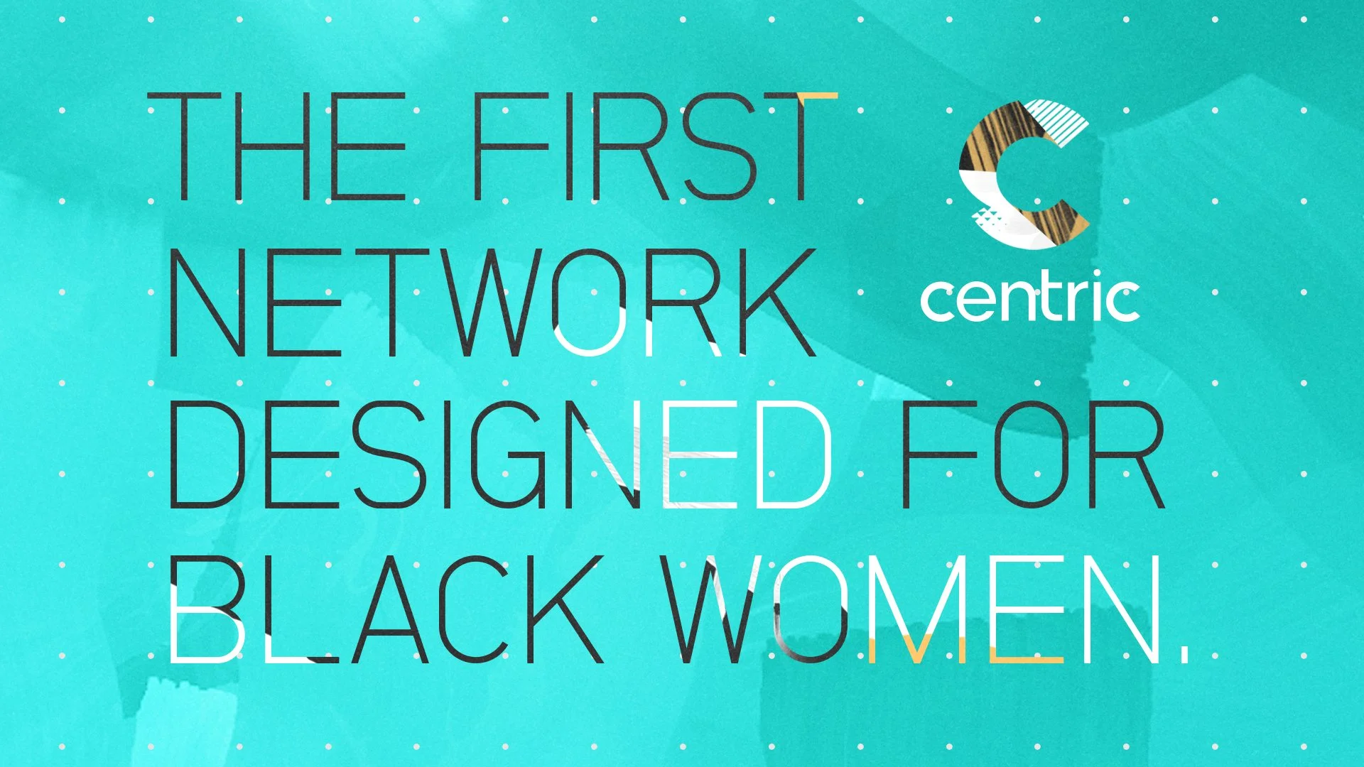
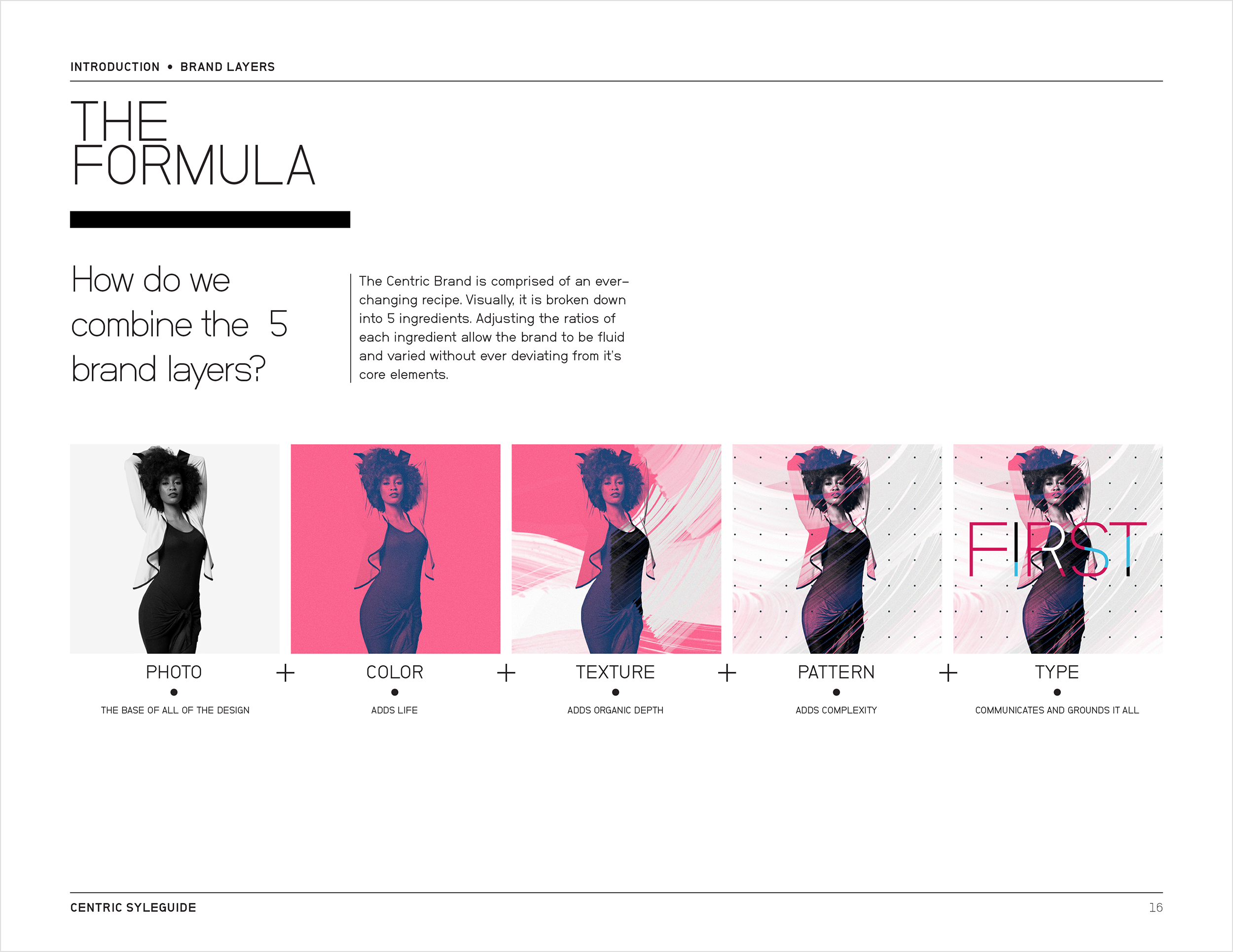
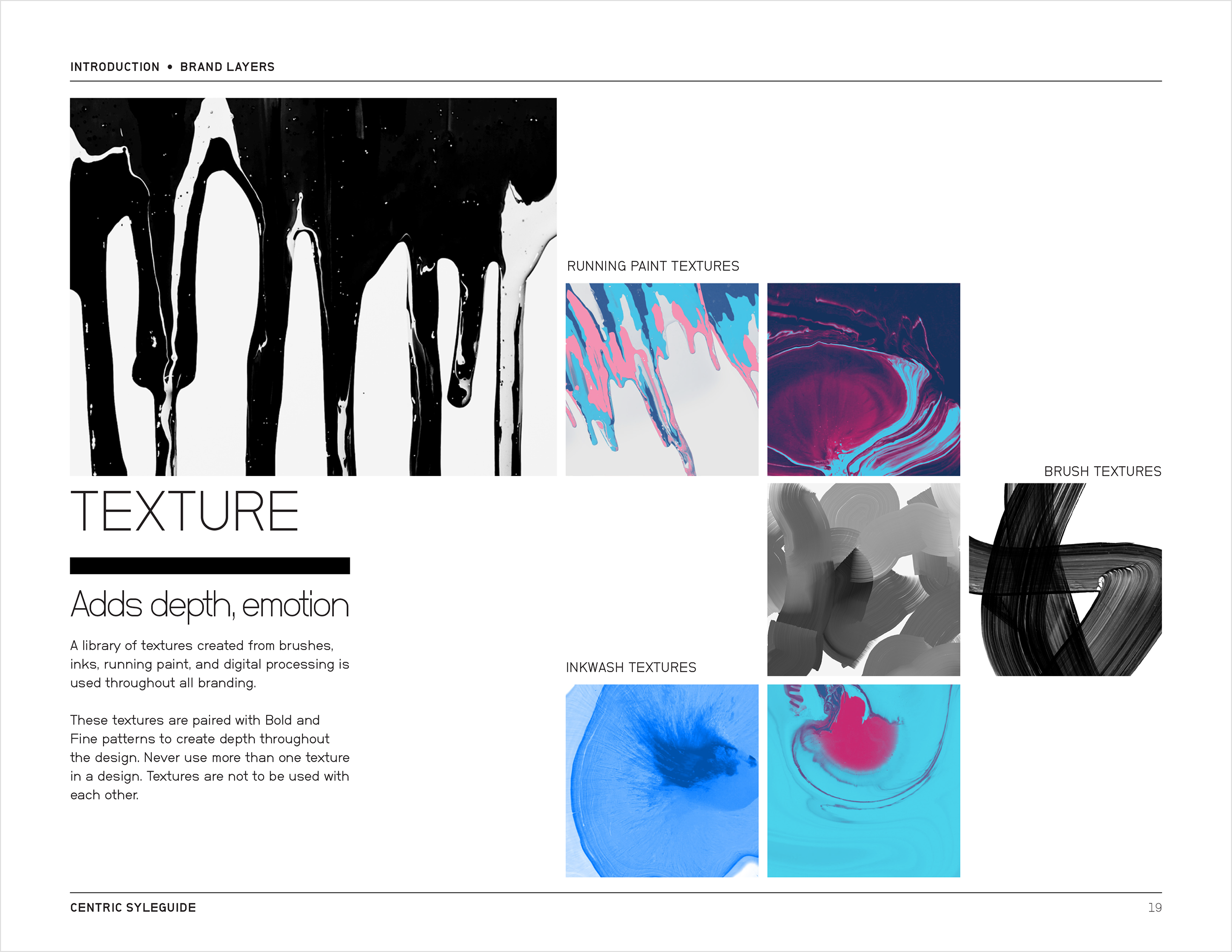
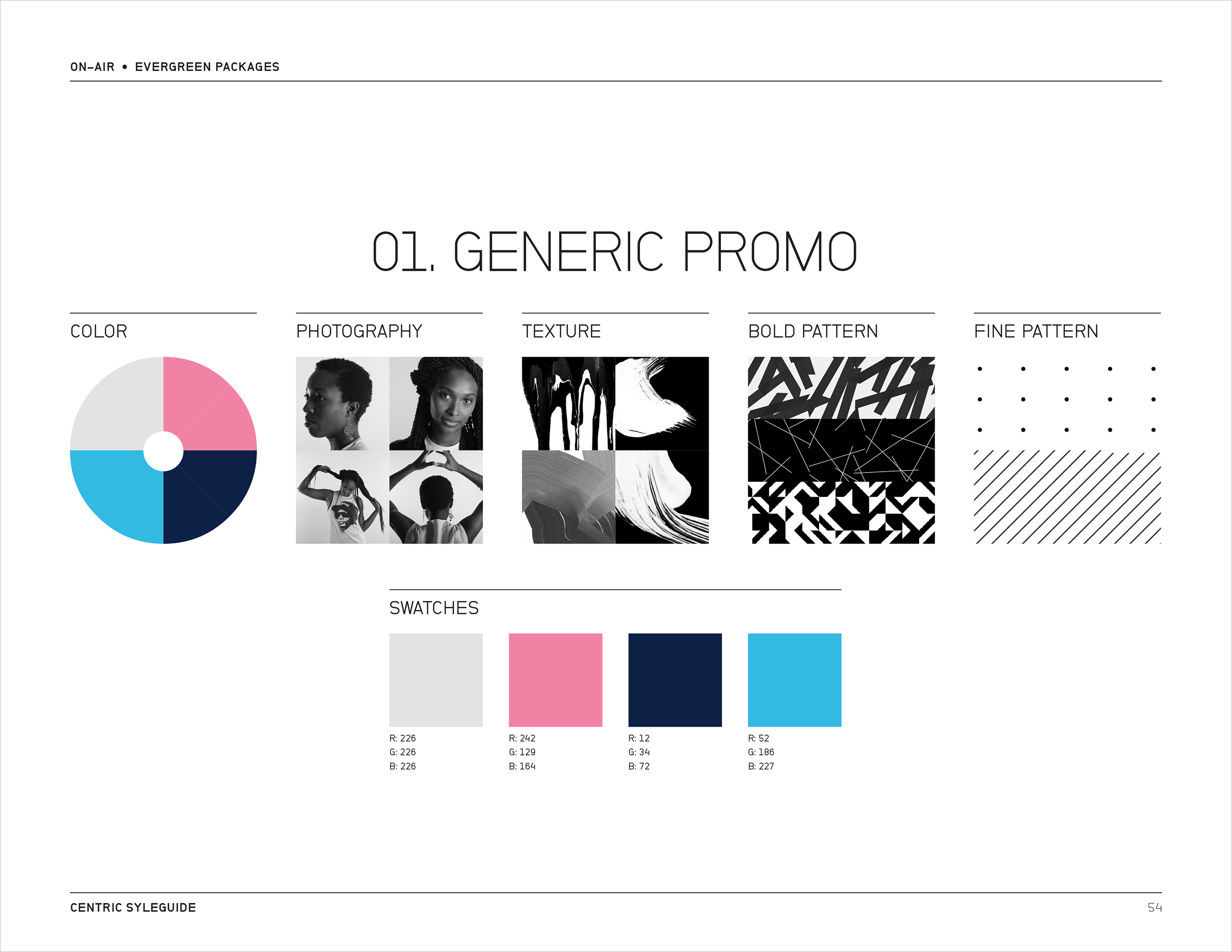
Different types of programming used the same five-part formula, with different combinations of the identity’s elements: photography, color, texture, pattern, and typography.
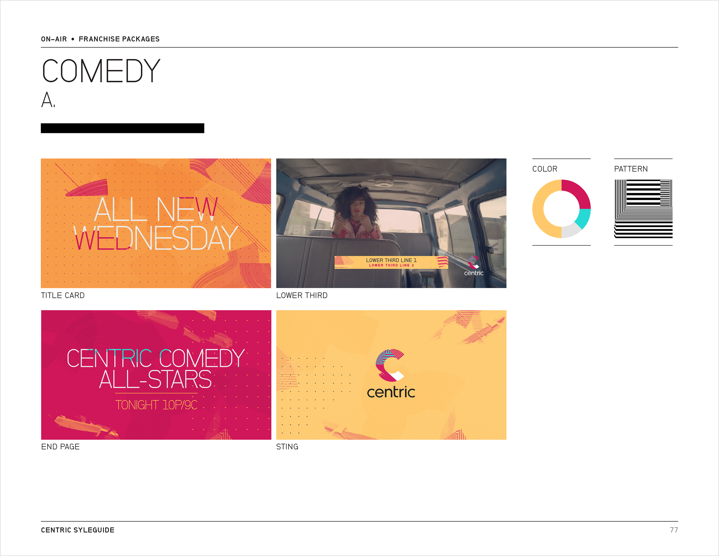
I worked through these variations to establish a clear structure and information hierarchy, showing designers how the individual components could be combined and applied consistently across on-air and promotional materials.
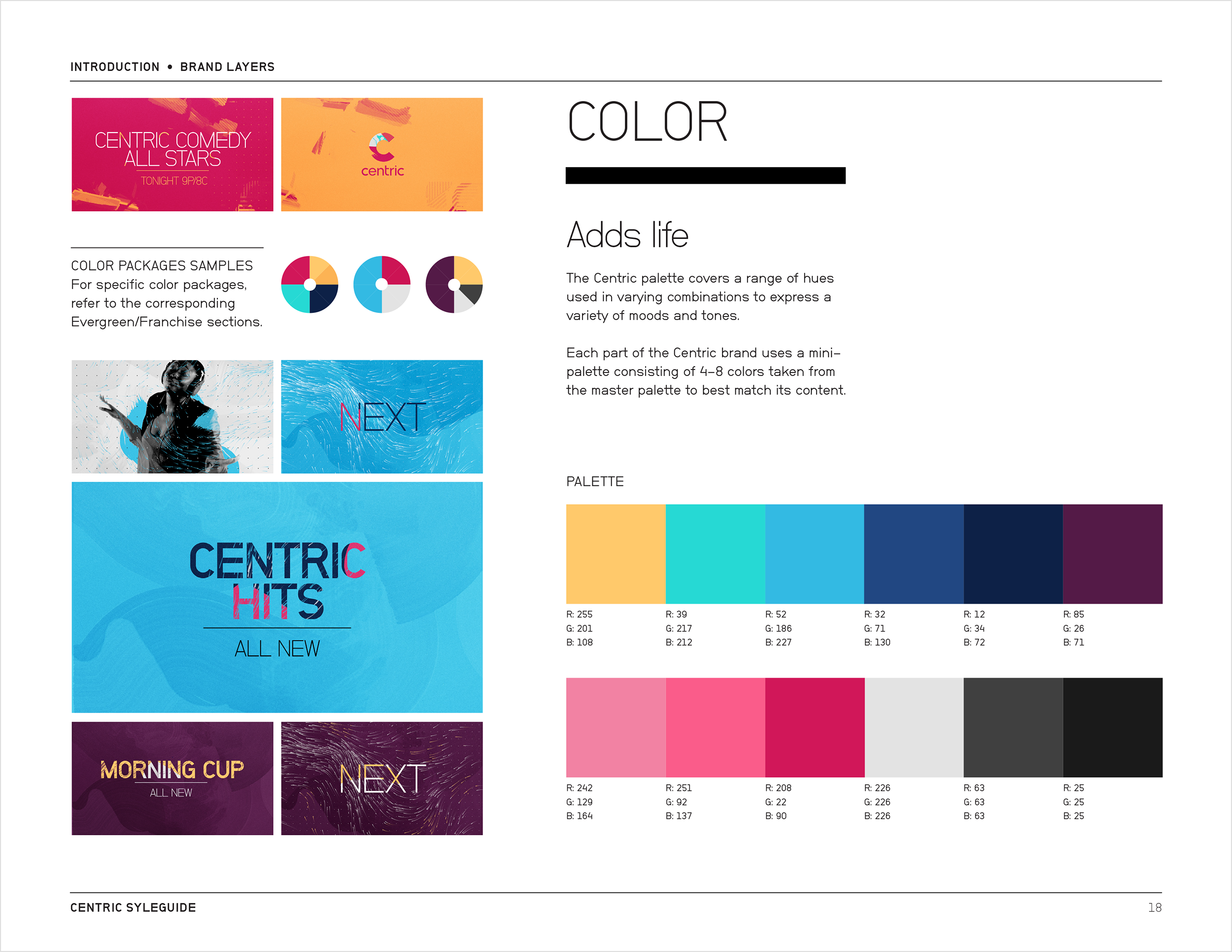
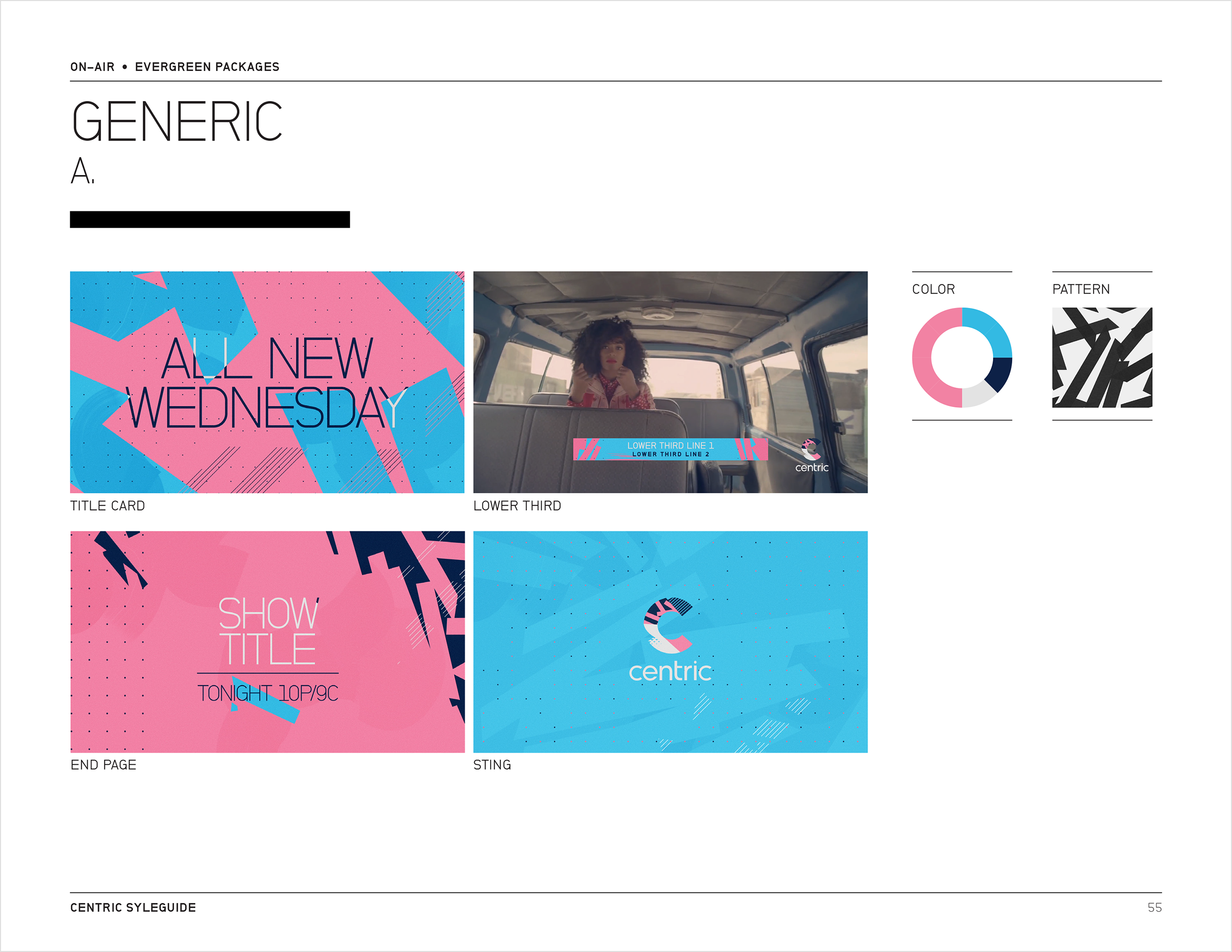
Evergreen Packages: Each programming package had a prescribed combination of color, photography, texture, and patterns, with guidelines showing how those elements translated into on-air applications.
Franchise Packages: For this programming package, a different combination of those same elements created a distinct visual language while keeping it recognizable as part of the larger Centric identity.